Classic box art ruined by localisation

A place where you can chat about anything that isn't to do with games!
User avatar
Skykid
Posts: 17655
Joined: Sun Nov 18, 2007 2:16 pm
Location: Planet Dust Asia

Classic box art ruined by localisation

Post by Skykid »

Box art inexplicably ruined by western localisations.

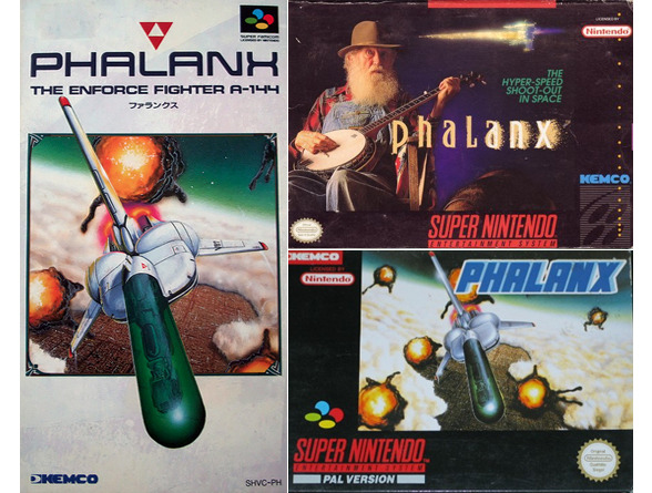
Rekindle the humour of yesteryear, remember why you started collecting Japanese versions of games, marvel that they paid someone to defecate over a perfectly amazing work, don't post the hillbilly from Phalanx or NES Mega Man again!

Only rule: You must post whatever examples of hilarity alongside the Japanese (or other) original for comparison.
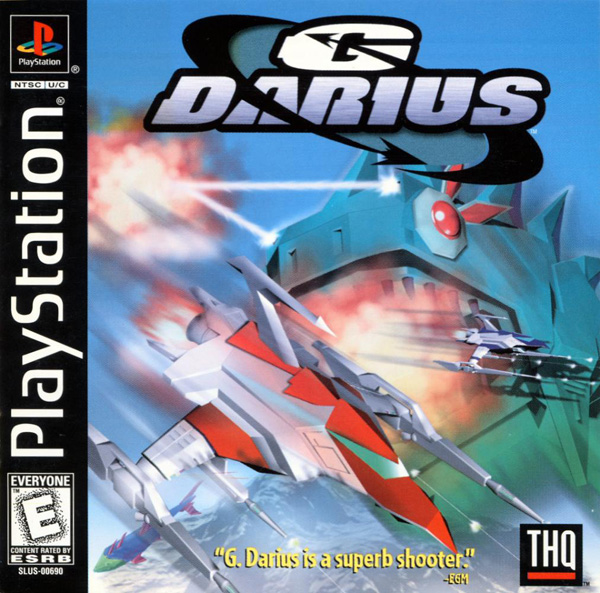
G-Darius

JAPAN

Image

USA

Image


SFC Prince of Persia

JAPAN

Image

USA

Image


Super Bust a Move

JAPAN/KOREA

Image

USA

Image


Rushing Beat Ran

JAPAN

Image

USA

Image
Last edited by Skykid on Sat Oct 11, 2014 3:20 pm, edited 1 time in total.
Always outnumbered, never outgunned - No zuo no die

User avatar
DrVenom
Posts: 20
Joined: Fri Dec 27, 2013 6:42 pm
Location: Denmark

Re: Classic box art ruined by localisation

Post by DrVenom »

I disagree with the first two.
G-Darius actually looks like something from the game and Prince of Persia is really a western game (even if this remake was made in Japan) and this art resembles the Prince of Persia 2 art as well.

Also I think both Rushing Beat covers are kind of ugly.
User avatar
options
Posts: 138
Joined: Mon Mar 22, 2010 12:18 pm
Location: [variable]

Re: Classic box art ruined by localisation

Post by options »

Street Fighter II

Japan

Image


US

Image


Street Fighter II Turbo

Japan

Image

US

Image

*shudder*

Einhander

Japan


Image


US

Image

The western version doesn't suck, it's just nowhere near as cool.
press play >>
User avatar
ptoing
Posts: 1118
Joined: Wed Jan 11, 2006 10:36 pm
Location: Gurmany
Contact:

Re: Classic box art ruined by localisation

Post by ptoing »

US vs Japan/Europe

Image
User avatar
Lord Satori
Posts: 2061
Joined: Thu Jul 26, 2012 5:39 pm

Re: Classic box art ruined by localisation

Post by Lord Satori »

ptoing wrote:US vs Japan/Europe

image
In an ideal cover I would take the US title font and put it on the original cover.

Also, the japan G-Darius image is broken.
BryanM wrote:You're trapped in a haunted house. There's a ghost. It wants to eat your friends and have sex with your cat. When forced to decide between the lives of your friends and the chastity of your kitty, you choose the cat.
User avatar
ptoing
Posts: 1118
Joined: Wed Jan 11, 2006 10:36 pm
Location: Gurmany
Contact:

Re: Classic box art ruined by localisation

Post by ptoing »

Lord Satori wrote:
ptoing wrote:US vs Japan/Europe

image
In an ideal cover I would take the US title font and put it on the original cover.
Sorry, but no. The treatment of the logo in the US version is very tacky use of Photoshop layer effects and would detract from the art of the original cover.
User avatar
Squire Grooktook
Posts: 5997
Joined: Sat Jan 12, 2013 2:39 am

Re: Classic box art ruined by localisation

Post by Squire Grooktook »

DrVenom wrote:I disagree with the first two.
G-Darius actually looks like something from the game and Prince of Persia is really a western game (even if this remake was made in Japan) and this art resembles the Prince of Persia 2 art as well.

Also I think both Rushing Beat covers are kind of ugly.
I like the JP cover of G-Darius better, but it's not a huge difference.

Prince of Persia 2 jp cover wins hands down though.
RegalSin wrote:Japan an almost perfect society always threatened by outsiders....................

Instead I am stuck in the America's where women rule with an iron crotch, and a man could get arrested for sitting behind a computer too long.
Aeon Zenith - My STG.
User avatar
MX7
Posts: 3224
Joined: Fri Mar 09, 2007 9:46 pm
Location: Cambridge
Contact:

Re: Classic box art ruined by localisation

Post by MX7 »

Most of the Western covers are as good, if not better than the Japnese versions. I clicked on this thread expecting some Phantasy Star 2 level horrible! But I'd forgotten about the NTSC-U version of ICO. thank god we missed out in that in Europe...
User avatar
ptoing
Posts: 1118
Joined: Wed Jan 11, 2006 10:36 pm
Location: Gurmany
Contact:

Re: Classic box art ruined by localisation

Post by ptoing »

Squire Grooktook wrote:Prince of Persia 2 jp cover wins hands down though.
Indeed. It looks like it was made by Katsuya Terada. Can't go wrong with that.
User avatar
Skykid
Posts: 17655
Joined: Sun Nov 18, 2007 2:16 pm
Location: Planet Dust Asia

Re: Classic box art ruined by localisation

Post by Skykid »

MX7 wrote:Most of the Western covers are as good, if not better than the Japnese versions.
:shock:
Always outnumbered, never outgunned - No zuo no die

User avatar
CIT
Posts: 4669
Joined: Thu Jun 30, 2005 2:39 pm
Location: Germany
Contact:

Re: Classic box art ruined by localisation

Post by CIT »

Classy:

Image

Trashy (and ripped off from a shitty movie poster, no less):

Image
User avatar
CIT
Posts: 4669
Joined: Thu Jun 30, 2005 2:39 pm
Location: Germany
Contact:

Re: Classic box art ruined by localisation

Post by CIT »

MX7 wrote:Most of the Western covers are as good, if not better than the Japnese versions. I clicked on this thread expecting some Phantasy Star 2 level horrible!
You don't really want us to get out the TurboGrafx-16 stuff do you?
User avatar
Ruldra
Posts: 4222
Joined: Wed Mar 05, 2008 1:27 am
Location: Brazil

Re: Classic box art ruined by localisation

Post by Ruldra »

Master System the thread: http://timewarpgamer.com/features/box_a ... y_sms.html

But this one takes the cake:

Image
[Youtube | 1cc list | Steam]
mastermx wrote:
xorthen wrote:You guys are some hardcore MOFOs and masochists.
This is the biggest compliment you can give to people on this forum.
User avatar
Skykid
Posts: 17655
Joined: Sun Nov 18, 2007 2:16 pm
Location: Planet Dust Asia

Re: Classic box art ruined by localisation

Post by Skykid »

Sorry about the broken G Darius JP cover, fixed now. I love the JP's arrangement on this one, particularly the logo - its cybernetic 'G' with fish-eye centre behind the steely Darius text is iconic for me. I can't believe they shat the whole thing up so absurdly on the US one, even replacing the logo with a generic Photoshop rush job. The weirdest part is the composition is the same: they essentially redrew it, but worse.

As it happens the EU version is better than the US (a third arrangement) although still no way near the JP original.

Image
Always outnumbered, never outgunned - No zuo no die

User avatar
BareKnuckleRoo
Posts: 6651
Joined: Mon Oct 03, 2011 4:01 am
Location: Southern Ontario

Re: Classic box art ruined by localisation

Post by BareKnuckleRoo »

CIT wrote:Guardic Gaiden
I still desperately want a print of that. I love Naoyuki Katoh's art so very much.

A classic:

Image

The JP original art isn't great or anything, but the totally unrelated guy with banjo art is still a complete headscratcher by comparison. More good SNES cover comparisons:

http://playingwithsuperpower.com/japane ... -art-pwns/
User avatar
Despatche
Posts: 4253
Joined: Thu Dec 02, 2010 11:05 pm

Re: Classic box art ruined by localisation

Post by Despatche »

arcade game flyers for american releases, regardless of where the game was made, like to advertise "profits" over the actual game and so tend to have bad visual design/art. iirc, many sega games in the late '80s had only master system-like flyers for their us releases. japanese flyers are generally really stylish to the point of being collectible, while world flyers tend to keep everything about the japanese flyers and just replace the japanese text with english/another language. pinball flyers tend to be much like japanese flyers, which makes it all even more sad

edit: i was mistaken, the pop sfc us art is indeed unique to this version. i still like it though, always have. there's something about it that elevates it above bad box art
Last edited by Despatche on Sat Oct 11, 2014 8:02 pm, edited 1 time in total.
Rage Pro, Rage Fury, Rage MAXX!
User avatar
Blackbird
Posts: 1563
Joined: Fri Dec 10, 2010 3:27 am
Location: East Coast USA

Re: Classic box art ruined by localisation

Post by Blackbird »

It always baffles me to see that they threw out beautiful illustrations like the Prince of Persia box art to replace them with something else; just seems like wasted expense. If I had to hazard a guess, I would assume it was a licensing/copyright issue; perhaps US localizations rarely got the rights to the illustrator's artwork for the cover.

Of course, when I was a child, I was none the wiser, because I got the US versions of the boxes and had no idea that another region of the world was getting awesome box art.
User avatar
BareKnuckleRoo
Posts: 6651
Joined: Mon Oct 03, 2011 4:01 am
Location: Southern Ontario

Re: Classic box art ruined by localisation

Post by BareKnuckleRoo »

In some cases, not using the original art could be a cost-savings measure. If it's a well-known artist who did the cover, you'd have to pay licensing costs to use their work, and to use it for the cover of a release overseas, the US/EU publisher I imagine would have to pay licensing fees as well. That might explain why in a few cases really high-quality art covers were replaced with far more mediocre covers (they found an artist to do it cheaper).
User avatar
Herr Schatten
Posts: 3285
Joined: Wed Jan 26, 2005 12:14 pm
Location: Germany
Contact:

Re: Classic box art ruined by localisation

Post by Herr Schatten »

Ruldra wrote:Master System the thread: http://timewarpgamer.com/features/box_a ... y_sms.html
I know I hated them when I was a kid, but today I kind of appreciate what Sega were trying to do with those covers. Pushing the Master System brand rather than the individual games was a bold move and it just might have worked had the cover illustrations been a little less shitty. Lacklustre quality of those aside, I do like the stylish approach Sega were taking. I do remember their games really standing out on shop shelves. Maybe they just were a little ahead of their time, or it was just a good idea ruined by poor execution.

To be fair, early western covers of NES games were not much prettier.
User avatar
cicada88
Posts: 652
Joined: Mon Oct 14, 2013 1:34 am

Re: Classic box art ruined by localisation

Post by cicada88 »

BareKnuckleRoo wrote: The JP original art isn't great or anything, but the totally unrelated guy with banjo art is still a complete headscratcher by comparison. More good SNES cover comparisons:

OP said not to include Phalanx or else :)

BTW, I think the original JP art is amazing
User avatar
BareKnuckleRoo
Posts: 6651
Joined: Mon Oct 03, 2011 4:01 am
Location: Southern Ontario

Re: Classic box art ruined by localisation

Post by BareKnuckleRoo »

How could you NOT post the hillbilly though? :lol:

Just remembered these:

Image

Image

The US/EU versions basically give you a demon crotch shot as opposed to the really cool Japanese cover. In fact, the Japanese covers of basically all the Gargoyle's Quest & spinoffs/sequels are far worse.

Image

Image

Yet another lovely view of his loincloth. :|
Last edited by BareKnuckleRoo on Sat Oct 11, 2014 5:36 pm, edited 1 time in total.
User avatar
Pretas
Banned User
Posts: 1688
Joined: Wed Apr 03, 2013 1:00 pm
Location: NTSC-US

Re: Classic box art ruined by localisation

Post by Pretas »

Can't leave out Mustache Yoko from Valis III. For whatever reason, US Turbografx-16 games had almost universally bad cover art.

Image

Image
Image
User avatar
soprano1
Posts: 3029
Joined: Wed Sep 18, 2013 4:44 pm
Location: Portugal

Re: Classic box art ruined by localisation

Post by soprano1 »

BareKnuckleRoo wrote:post too long
You know what's funny? I would be less offended if i was a soccer mom from the 90's if my son was playing a game with the JP covers.
"What is this Satanic game?!"
:lol:

edit: And let's not forget the Klan looking enemy from the GB US cover...
ChurchOfSolipsism wrote:I'll make sure I'll download it illegally one day...
User avatar
BulletMagnet
Posts: 14151
Joined: Wed Jan 26, 2005 4:05 am
Location: Wherever.
Contact:

Re: Classic box art ruined by localisation

Post by BulletMagnet »

BareKnuckleRoo wrote:The JP original art isn't great or anything, but the totally unrelated guy with banjo art is still a complete headscratcher by comparison.
As ridiculous as he is, I can never bring myself to hate Pharmer Bob, if only for the sheer marketing chutzpah/insanity he represents.
User avatar
Xan
Posts: 760
Joined: Mon Sep 23, 2013 12:04 pm

Re: Classic box art ruined by localisation

Post by Xan »

Most classic case of this for me:

Image
Image

Seriously, the NTSC-U cover looks like something they threw together in five minutes...
User avatar
Skykid
Posts: 17655
Joined: Sun Nov 18, 2007 2:16 pm
Location: Planet Dust Asia

Re: Classic box art ruined by localisation

Post by Skykid »

Ha ha, that Demon's Crest is hilarious! :D

To set it straight, and unless all the magazines I used to read during my childhood had it wrong, the only reason the cover art was changed regionally was for marketing purposes. US distributors were essentially blind and considered the Japanese art to be less palatable to an American audience, so it was discarded in place of a less cartoons, more 'adult', totally shitted up version. Often the JP version of art would bypass the US magically and still end up on EU releases - a good example being the Phalanx above. In some cases it even extended to consoles, the EU getting both the original Super Famicom design and (thank God) Mega Drive brand.
Always outnumbered, never outgunned - No zuo no die

User avatar
Pretas
Banned User
Posts: 1688
Joined: Wed Apr 03, 2013 1:00 pm
Location: NTSC-US

Re: Classic box art ruined by localisation

Post by Pretas »

Didn't another company already own the trademark on Mega Drive in the US? Similar to how the European Dreamcast logo changed its color because someone else there was already using an orange spiral.
Image
User avatar
soprano1
Posts: 3029
Joined: Wed Sep 18, 2013 4:44 pm
Location: Portugal

Re: Classic box art ruined by localisation

Post by soprano1 »

Pretas wrote:Didn't another company already own the trademark on Mega Drive in the US? Similar to how the European Dreamcast logo changed its color because someone else there was already using an orange spiral.
I thought the Genesis name was just a marketing thing for the US market.
As for the Dreamcast logo, i think it was some cd maker company who had that, but i'm not sure.
ChurchOfSolipsism wrote:I'll make sure I'll download it illegally one day...
User avatar
Specineff
Posts: 5768
Joined: Wed Jan 26, 2005 12:54 am
Location: Ari-Freaking-Zona!
Contact:

Re: Classic box art ruined by localisation

Post by Specineff »

Tivola's symbol is an orange swirl as well. It looks more like a ribbon, but I can't blame Sega for wanting to cover their backs.
Don't hold grudges. GET EVEN.
User avatar
KAI
Posts: 4672
Joined: Thu Jan 21, 2010 5:24 pm
Location: Joker Star Galaxy, Argentina
Contact:

Re: Classic box art ruined by localisation

Post by KAI »

Toshinden JAP
Image

Toshinden West
Image

Almost an entire decade destroying Kotobuki Tsukasa's work.
Image
Post Reply