I've been thinking about what makes a good Heads Up Display and why. I've been looking for an article or blog post from somebody in the art scene about HUDs. My google-fu is weak and have found nothing.
I thought a good HUD would boil down to:
-Informative
-Unintrusive
-Aesthetically Pleasing
...but I am unqualified to preach this.
If nothing else, post examples of HUDs that stand out.
Examples:
GigaWing
Color coded digit grouping for easier identification of large scores
Life Force (NES)
Entire HUD disappears only during boss encounters
Geometry Wars 2
displays hi score of the friend just above your best score
Trials HD
Ghost progress indicator without showing the actual ghost.
Friend indicator of where a run ended (minigames)
Parsec47
Large awkward vertical score
Gokujou Parodius
Quick warnings of enemy spawns only when appearing in uncommon areas of the playfield (Special Stage)
Sexy Parodius
Indicator of the enemy bullet that killed you (manual setting)
radiangames Ballistic
Detailed player statistics embedded in the background layer. Readable in-between enemy waves
Mushihimesama
Same boss lifebar on the top and bottom of the playfield.
Mushihimesama Futari (& other Cave games)
Additonal boxes in the yoko wallpaper that zoom in on smaller areas of the HUD.
Armed Police Batrider (& other Raizing Games)
Dedicated text to identify what stage or boss the player is in.
Every new song that plays, text appears in the corner telling what the track is named
The House of the Dead 3
Boss lifebar has a separate lifebar identifying when the boss can be stunned or transform into the next boss fight segment
Dimahoo / Space Bomber
Bomb/Special Weapon stock set behind the player craft, eliminating HUD clutter
Ikaruga
Vertical progress bar for homing lasers.
HUD position configuration (In playfield or in wallpaper)
Kirby 64
Choose a HUD skin
DoDonPachi SaiDaiOuJou
Very large vertical text indicator when hyper is ready
DoDonPachi
Collecting max bombs changes entire bomb HUD section to "Maximum"
G-Darius (PSX) / Thunder Force V / Batsugun (Saturn) / Galactic Attack (Saturn)
Option to shut entire HUD off
Gradius series vs spinoffs
The official numbered entries in the series have a powerup bar where every item is spelled out. Spinoffs (Life Force, Parodius, Gaiden, Neo, etc.) have a condensed powerup bar of small rectangles or squares, either replaced with images or a highlight with one space off to the side to explain what powerup is currently highlighted. Parodius Da is the only exception.
Akai Katana
HUD jumps to different parts of the screen depending on player's position
Akai Katana / Espgaluda 1&2
Limited button activated modes (Kakusei, Phantom, etc.) display a timer circling your player craft instead of a HUD gauge.
Progear / Deathsmiles
HUD goes transparent when player craft enters that area of the screen
Rez
Computer code gibberish constantly fills the upper left of the screen. Some of it is informative like how many enemies you highlighted in a combo. Most of it is nonsense. The font is too hard to read without squinting anyway. This HUD is artistic in that it gives a better impression you are actually hacking into the stages, which is technically the object of the game.
Shogun: Rise of the Renegade
Weapon change buttons surround the player craft when finger lifted, eliminating HUD clutter
Danmaku Death
Shield/Special Weapon button activated with adding second finger (multitouch) press instead of dedicated button, eliminating HUD clutter
Dead Space
Placing most HUD indicators on the player character, almost eliminating need for static HUD entirely
Esp.Ra.De / EspGaluda
Visual cue when a bomb is charged (Instead of a HUD meter)
Megaman
Design decision to shove everything into a separate menu. A minimalistic approach to what actually remains onscreen during play.
Metroid Prime
HUD artistically designed as if info is really displaying inside Samus' helmet, giving better impression she sees what you see.
Smash Bros
Right stick moves the camera around, revealing a 3D-esq effect on all the menu buttons.
Descent
Players can choose from the atmospheric cramped cockpit (with HUD elements built-in), or go fullscreen with all HUD elements in text.
--------------------
Recommendations:
For arcade games, a good HUD should disappear during cutscenes and transitions in order to help prevent screen burn-in. All game graphical elements should be removed so that you don't get Stratovoxitis. Ideally there should be some period where the monitor is blanked completely during an attract cycle.
Art of Heads-up Displays (HUD)
-
DJ Incompetent

- Posts: 2374
- Joined: Tue Jun 13, 2006 10:28 pm
- Location: Murda Mitten, USA
Art of Heads-up Displays (HUD)
Last edited by DJ Incompetent on Wed Jul 18, 2012 1:36 pm, edited 1 time in total.
@shmups | superplaymixes Reworked Game Soundtracks | livestreamin'
______________________

Re: Art of Heads-up Displays (HUD)
For arcade games, a good HUD should disappear during cutscenes and transitions in order to help prevent screen burn-in.
-
Op Intensify
- Posts: 1090
- Joined: Sun Apr 29, 2012 2:19 am
Re: Art of Heads-up Displays (HUD)
I've always liked that in Cave shmups with potentially intrusive HUD elements (Progear, Deathsmiles), such elements move out of the way or go transparent when you move over them.

Re: Art of Heads-up Displays (HUD)
You know I never thought about that, but it is actually a very good point.Ganelon wrote:For arcade games, a good HUD should disappear during cutscenes and transitions in order to help prevent screen burn-in.
Look at our friendly members:
MX7 wrote:I'm not a fan of a racist, gun nut brony puking his odious and uninformed arguments over every thread that comes up.
Drum wrote:He's also a pederast. Presumably.
-
BareKnuckleRoo

- Posts: 6654
- Joined: Mon Oct 03, 2011 4:01 am
- Location: Southern Ontario
Re: Art of Heads-up Displays (HUD)
Blazing Star - While otherwise a good game, the HUD (the charge bar in particular) fails to get out of the way if you move behind it. 
EspGaluda 2 - Not technically part of the HUD, but still a graphical design flaw. In Esp.Ra.De and EspGaluda 1, when using a charged bomb you'd get a visual cue (flashing color change) the moment you reached max charge. There doesn't seem to be any visual cue when you charge a bomb other than having to look and see when you've expended half the bomb gauge if you're trying to use a full-powered bomb. On the other hand, both Galuda games are good in that the Kakusei meter pops up around the character as well as is indicated in the top corner.
Descent - You can choose from the atmospheric cramped cockpit (with HUD elements built-in), or go fullscreen with all HUD elements in text.
Mega Man series - great example of minimalism being better than too many on-screen elements.

Re: Art of Heads-up Displays (HUD)
Not to mention that all game graphical elements should be removed so that you don't get Stratovoxitis. Ideally there should be some period where the monitor is blanked completely during an attract cycle.Ganelon wrote:For arcade games, a good HUD should disappear during cutscenes and transitions in order to help prevent screen burn-in.
-
BPzeBanshee

- Posts: 4859
- Joined: Sun Feb 08, 2009 3:59 am
Re: Art of Heads-up Displays (HUD)
Interesting that you should post this. I sat down and thought a lot about this some time ago regarding the game projects I'm working on and got what I believe is good results. Take a look:
GMOSSE:

I like having things like FPS display and object count but with the setup I had it got to a point where it taking up too much of the bottom of the screen, so in addition to modifying the Score display I revamped the debug display (which of course can be turned off if you wish). Also the music information is displayed with separate colours on the left so it is easily visible, and only appears briefly at the beginning of a stage. The space inbetween the blue chain bar and the score display is reserved for the boss healthbar currently.
Aero Flux [Radical Proposal]:

This game used to run in 640x480 but had a game area of 351x480 so the HUD was around the portrait panels on the sides. For implementing a proper TATE mode using the new resolution this obviously wasn't appropriate as you had no information displayed in the game screen, so I came up with this replacement for Pieterator. The space up the top is reserved for the boss healthbar.
Of course all of these are dimmed when the player goes into that area, and aren't featured anywhere else but in-game so menus and such won't get in-game HUD burnin in theory.
GMOSSE:
I like having things like FPS display and object count but with the setup I had it got to a point where it taking up too much of the bottom of the screen, so in addition to modifying the Score display I revamped the debug display (which of course can be turned off if you wish). Also the music information is displayed with separate colours on the left so it is easily visible, and only appears briefly at the beginning of a stage. The space inbetween the blue chain bar and the score display is reserved for the boss healthbar currently.
Aero Flux [Radical Proposal]:
This game used to run in 640x480 but had a game area of 351x480 so the HUD was around the portrait panels on the sides. For implementing a proper TATE mode using the new resolution this obviously wasn't appropriate as you had no information displayed in the game screen, so I came up with this replacement for Pieterator. The space up the top is reserved for the boss healthbar.
Of course all of these are dimmed when the player goes into that area, and aren't featured anywhere else but in-game so menus and such won't get in-game HUD burnin in theory.
Re: Art of Heads-up Displays (HUD)
Those both look bad to me. Why do you need two huge gauges per ship? Don't get me started on the first screenshot...I suppose that thin blue line is supposed to be a chain indicator, but it's just about the only thing in the shot that's not eye-raping.

Re: Art of Heads-up Displays (HUD)
Perhaps a bit unrelated, but Thunder Force V allowed you to hide the HUD completely at the push of a button. Technosoft, you clever bastards.
Don't hold grudges. GET EVEN.
-
TransatlanticFoe

- Posts: 1869
- Joined: Mon Jan 24, 2011 11:06 pm
- Location: UK
Re: Art of Heads-up Displays (HUD)
The Saturn ports for Batsugun and Galactic Attack let you do this too, probably because they're pretty intrusive (certainly in non-TATE).
-
BPzeBanshee
- Posts: 4859
- Joined: Sun Feb 08, 2009 3:59 am
Re: Art of Heads-up Displays (HUD)
Well, they're in-development games - they need all the constructive criticism they can get! I have a link to the development thread in my signature if you want to take it there, that way I can at least try to improve it more before next release if you're willing to provide some useful advice other than "it's terrible".Ed Oscuro wrote:Those both look bad to me. Why do you need two huge gauges per ship? Don't get me started on the first screenshot...I suppose that thin blue line is supposed to be a chain indicator, but it's just about the only thing in the shot that's not eye-raping.
With the second one, the gauges are already smaller than their former incarnations (they had huge boxes around them) and represent power level, amount of bombs and amount of graze till a bomb is obtained. The level could probably get killed off but bomb stock and grazing process are pretty important in Aero Flux so a redraw rather than complete removal is preferable.
-
null1024

- Posts: 3823
- Joined: Sat Dec 15, 2007 8:52 pm
- Location: ʍoquıɐɹ ǝɥʇ ɹǝʌo 'ǝɹǝɥʍǝɯos
- Contact:
Re: Art of Heads-up Displays (HUD)
If you want the gauges, have them vertically oriented. Will look much, much better.BPzeBanshee wrote:Well, they're in-development games - they need all the constructive criticism they can get! I have a link to the development thread in my signature if you want to take it there, that way I can at least try to improve it more before next release if you're willing to provide some useful advice other than "it's terrible".Ed Oscuro wrote:Those both look bad to me. Why do you need two huge gauges per ship? Don't get me started on the first screenshot...I suppose that thin blue line is supposed to be a chain indicator, but it's just about the only thing in the shot that's not eye-raping.
With the second one, the gauges are already smaller than their former incarnations (they had huge boxes around them) and represent power level, amount of bombs and amount of graze till a bomb is obtained. The level could probably get killed off but bomb stock and grazing process are pretty important in Aero Flux so a redraw rather than complete removal is preferable.
Come check out my website, I guess. Random stuff I've worked on over the last two decades.
Re: Art of Heads-up Displays (HUD)
A good HUD displays a lot of information very intuitively and clearly while being unobtrusive and obscuring as little of the screen as possible.
For an example of how -not- to design a HUD, look at any Sting game .
.
For an example of how -not- to design a HUD, look at any Sting game
-
mesh control

- Posts: 2496
- Joined: Mon Dec 21, 2009 1:10 am
- Location: internet
Re: Art of Heads-up Displays (HUD)
File Wipeout 3 under "aesthetically pleasing".
Perfect art direction.
Perfect art direction.
lol
-
null1024
- Posts: 3823
- Joined: Sat Dec 15, 2007 8:52 pm
- Location: ʍoquıɐɹ ǝɥʇ ɹǝʌo 'ǝɹǝɥʍǝɯos
- Contact:
Re: Art of Heads-up Displays (HUD)
Wipeout 3's HUD looks confusing to a lot of people, but 1: it's very unobtrusive, 2: it shows important info [like health] as a meter [especially important at a glance] and a number, and 3: it looks damn cool.mesh control wrote:File Wipeout 3 under "aesthetically pleasing".
Perfect art direction.
On another note, the HUD in Smash Bros. isn't exactly aesthetically appealing [until Brawl at least], but one thing I like about it is that it changes color based on damage level for at-a-glance info.
The moral is, being able to look at a HUD, get the needed information, and have it not get in the way is the most important thing to think about when designing them. Looking good is important, as it's on the screen a lot, but appearance shouldn't seriously override utility.
Also, Progear's HUD is awesome, because it gets the hell out of your way when you get too close. I always liked that.
Come check out my website, I guess. Random stuff I've worked on over the last two decades.

Re: Art of Heads-up Displays (HUD)
Although not a game-related example, it might be interesting to take a look at some of the HUDs used in TV sports broadcasts as well. Generally, the ones that work best seem to be the ones that are as unobtrusive as possible (although the networks rarely bother with this, they're too busy adding flashy graphics and gratuitous effects.) I mostly go from baseball examples, but the ones that fit in a corner of the screen tend to work a lot better than the ones that take up a bar at the top of the screen.
-
BPzeBanshee
- Posts: 4859
- Joined: Sun Feb 08, 2009 3:59 am
Re: Art of Heads-up Displays (HUD)
Righto, I'll rip out the level meter and flip the bomb gauge so it's pointing up on the corners. Thanks for the advice.null1024 wrote: If you want the gauges, have them vertically oriented. Will look much, much better.
Re: Art of Heads-up Displays (HUD)
OK, instead of being a jerk, this time I will try to give another suggestion (of probably questionable merit) for meters and counts!
Oftentimes it is much better and more immediate to give cues from the game entities themselves - think of a beat-em-up game boss telegraphing a move.
A chain (or similar) indicator might be reformed as an aura or even a ship color change. Or, if it fits better, you could make the enemies change appearance based on chains (and possibly work some kind of plausible technobabble into your explanation, as well). Depending on how much you have going in the background, you could even make the background visually change to reflect current chaining statuses (I don't think this would be completely unprecedented for shooters either). Of these, I would prefer an "aura" or charge type of view as well. So long as it doesn't interfere with visibility or other mechanics, it looks like a fairly simple way to present important information without drawing your eye away or using screen space unnecessarily.
In theory you could do the same for bombs (show each under-wing) but that would be tricky to pull off. Tiger Heli does it, sort of. Not really advisable, as it could be hard to see and would limit the number of bombs or ship design.
If you do keep a chain meter, from the game that has it (the one where I used the ill-advised phrase "eye-raping," who do I think I am, a Something Awful staff writer?), it is one of the least visible things. Dark blue is not far from the black background.
-
Obiwanshinobi

- Posts: 7470
- Joined: Sun Jul 26, 2009 1:14 am
Re: Art of Heads-up Displays (HUD)
Zanac Neo lets you know your ultimate weapon is charged with the controller's rumble feature. Works so well I don't even know if there's any visible indicator.
The rear gate is closed down
The way out is cut off

The way out is cut off
-
Op Intensify
- Posts: 1090
- Joined: Sun Apr 29, 2012 2:19 am
Re: Art of Heads-up Displays (HUD)
Armored Core V gets a lot of flak for having an overly confusing HUD. Really, it just requires a learning curve to remember which bar indicates what (AP, energy, left/right weapon ammo, and Ultimate Weapon charge when applicable). I like that all necessary information is right in the center of the screen at all times. When you get used to it it's actually better, considering all the precision aiming.
Similarly, Umihara Kawase has a strange-looking "zoomed in" HUD. This is so your eyes don't have to dart to the margins of the screen every time you want to look at it, which can be enough to lose your focus and screw up.
Similarly, Umihara Kawase has a strange-looking "zoomed in" HUD. This is so your eyes don't have to dart to the margins of the screen every time you want to look at it, which can be enough to lose your focus and screw up.
-
BPzeBanshee
- Posts: 4859
- Joined: Sun Feb 08, 2009 3:59 am
Re: Art of Heads-up Displays (HUD)
Interesting. Your examples seem very centered around the actual player object which would suggest a player-centric approach: ie. if the bar (or aura, or whatever to represent the chain meter) was somewhere on the player instead of on the top-left of the screen (like every Dodonpachi-like game ever) then it would be in theory less irritable.Ed Oscuro wrote:If you do keep a chain meter, from the game that has it (the one where I used the ill-advised phrase "eye-raping," who do I think I am, a Something Awful staff writer?), it is one of the least visible things. Dark blue is not far from the black background.
I had considered player-centric displays like what you mentioned before but worried that it'd be somewhat distracting (especially with a bright colour) or worse yet, too suttle so the player doesn't get it. For this I went with the dark blue bar on the top left and slightly transparent approach but as you've made apparent this just won't do.
The mention of ESPGaluda's kakusei meter gave me an idea though. Better or worse?:

The meter starts off being bright blue with 1/2 transparency, but when it goes down it'll eventually fade into the darker blue you saw in the previous bar and fade out. Now that the bar isn't up on the top-left, the score display itself has been moved up by 5 pixels so it's closer to the lives/bomb icons with space remaining for the boss healthbar (which itself isn't that different from the score bar except screen-wide and green/red tint).

Re: Art of Heads-up Displays (HUD)
Bombs or lives display should be at the top, not both.
@trap0xf | daifukkat.su/blog | scores | FIRE LANCER
<S.Yagawa> I like the challenge of "doing the impossible" with older hardware, and pushing it as far as it can go.
<S.Yagawa> I like the challenge of "doing the impossible" with older hardware, and pushing it as far as it can go.
Re: Art of Heads-up Displays (HUD)
I was thinking of an outline. That simple blue circle might make positioning your craft a bit troublesome (or not, but it seems it should be centered around the actual hitbox, not the middle of the player sprite, if there's a difference).BPzeBanshee wrote:Interesting. Your examples seem very centered around the actual player object which would suggest a player-centric approach: ie. if the bar (or aura, or whatever to represent the chain meter) was somewhere on the player instead of on the top-left of the screen (like every Dodonpachi-like game ever) then it would be in theory less irritable.Ed Oscuro wrote:If you do keep a chain meter, from the game that has it (the one where I used the ill-advised phrase "eye-raping," who do I think I am, a Something Awful staff writer?), it is one of the least visible things. Dark blue is not far from the black background.
I had considered player-centric displays like what you mentioned before but worried that it'd be somewhat distracting (especially with a bright colour) or worse yet, too suttle so the player doesn't get it. For this I went with the dark blue bar on the top left and slightly transparent approach but as you've made apparent this just won't do.
The mention of ESPGaluda's kakusei meter gave me an idea though. Better or worse?:
The meter starts off being bright blue with 1/2 transparency, but when it goes down it'll eventually fade into the darker blue you saw in the previous bar and fade out. Now that the bar isn't up on the top-left, the score display itself has been moved up by 5 pixels so it's closer to the lives/bomb icons with space remaining for the boss healthbar (which itself isn't that different from the score bar except screen-wide and green/red tint).
-
BPzeBanshee
- Posts: 4859
- Joined: Sun Feb 08, 2009 3:59 am
Re: Art of Heads-up Displays (HUD)
Currently hitbox position is the center of the player anyway, but thanks for the mention. Set to draw around player's hitbox instead of player now in case of future ships having hitboxes away from center.
By outline, you mean as in an outline of the actual ship sprite or the ring thickness? I've reduced the thickness and brought it a bit closer to the ship itself but I don't think that's what you mean.
Bombs in separate area from lives also noted. Music info's been moved up from bottom-left corner and now appears just above the bombs which are there instead. See below:

Any better?
By outline, you mean as in an outline of the actual ship sprite or the ring thickness? I've reduced the thickness and brought it a bit closer to the ship itself but I don't think that's what you mean.
Bombs in separate area from lives also noted. Music info's been moved up from bottom-left corner and now appears just above the bombs which are there instead. See below:
Any better?
Re: Art of Heads-up Displays (HUD)
That looks way better. I think maybe score should be above lives (since lives typically matters more, so it should be in a more obvious place.
I would put the multiplier under the score, either under the lives or next to them. It's fine next to the score, but I think it'd look better in a different place.
I would put the multiplier under the score, either under the lives or next to them. It's fine next to the score, but I think it'd look better in a different place.
@trap0xf | daifukkat.su/blog | scores | FIRE LANCER
<S.Yagawa> I like the challenge of "doing the impossible" with older hardware, and pushing it as far as it can go.
<S.Yagawa> I like the challenge of "doing the impossible" with older hardware, and pushing it as far as it can go.
-
BPzeBanshee
- Posts: 4859
- Joined: Sun Feb 08, 2009 3:59 am
Re: Art of Heads-up Displays (HUD)
Okay, I think I got it just about down-pat thanks to you guys, except for maybe the ring. The HUD is able to be switched from the 'Normal' (what I had to begin with + Ed's suggestion fix for the colour) to the 'Elitist' HUD (lol couldn't think of a better name) via the options menu.

My apologies for hijacking the thread, by the way.
My apologies for hijacking the thread, by the way.

Re: Art of Heads-up Displays (HUD)
Just make it unobtrusive. Check this wonderful 1986 game:
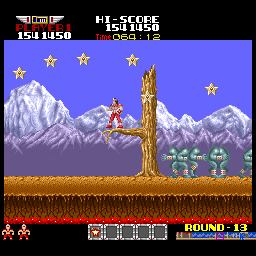
Rank up to the left, score + time in the middle (time is relevant to scoring well btw here). Lives left bottom left, power ups collected in the middle, stage map to the right (game scrolls to the right btw). Oh, and big scoring bonuses was a short but huge on screen thing as to reflect how awesome they were:

Rank up to the left, score + time in the middle (time is relevant to scoring well btw here). Lives left bottom left, power ups collected in the middle, stage map to the right (game scrolls to the right btw). Oh, and big scoring bonuses was a short but huge on screen thing as to reflect how awesome they were:
 | My games - http://www.emphatic.se
RegalSin wrote:Street Fighters. We need to aviod them when we activate time accellerator.