Classic box art ruined by localisation

Re: Classic box art ruined by localisation
I like some of the Atari 2600 and 7800 box arts of Nintendo ports over their NES counterparts.
Last edited by BrianC on Mon Oct 13, 2014 4:44 am, edited 1 time in total.
-
Lord Satori

- Posts: 2061
- Joined: Thu Jul 26, 2012 5:39 pm
Re: Classic box art ruined by localisation
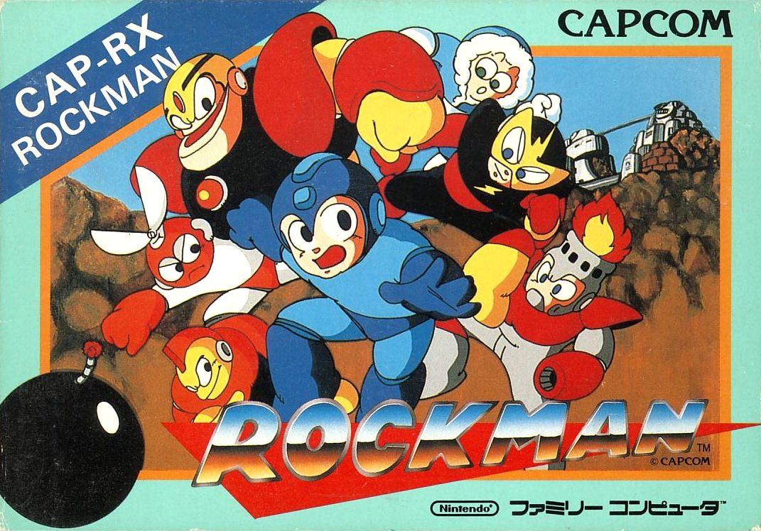
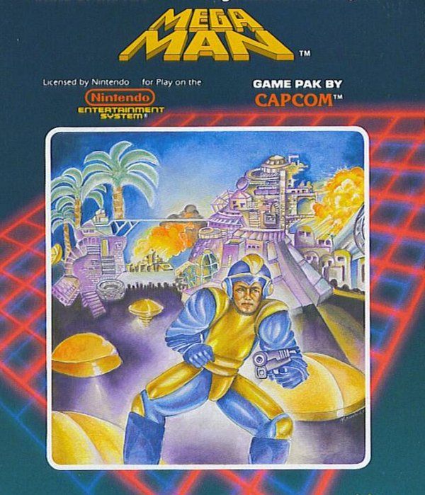
Oh my god, this! I don't know if this is worse, or the art for 9 reminding us about it. (no I will NEVER shut up about that) I am so sorry, Mega-kun. You've seen better days.Vexorg wrote:Another classic example:
The Japanese box art for Rockman:
The US box art for Megaman:
BryanM wrote:You're trapped in a haunted house. There's a ghost. It wants to eat your friends and have sex with your cat. When forced to decide between the lives of your friends and the chastity of your kitty, you choose the cat.
-
EmperorIng

- Posts: 5223
- Joined: Mon Jun 18, 2012 3:22 am
- Location: Chicago, IL
Re: Classic box art ruined by localisation
Considering how Mega Man is a dead series, that statement is appropriate on multiple levels.

DEMON'S TILT [bullet hell pinball] - Music Composer || EC2151 ~ My FM/YM2612 music & more! || 1CC List || PCE-CD: The Search for Quality
Re: Classic box art ruined by localisation
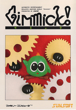
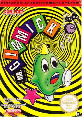
Gimmick! for NES
JAPAN:
NORDIC EU:
JAPAN:
NORDIC EU:

Re: Classic box art ruined by localisation
[/quote]apatheticTurd wrote:
Big fan of minimalist covers, but I don't even know what I'm looking at with the Japanese one.


I think the pal cover is the best of the bunch here.
http://img.gamefaqs.net/box/4/8/2/19482_front.jpg
the image is massive so I haven't embedded it.
-
null1024

- Posts: 3823
- Joined: Sat Dec 15, 2007 8:52 pm
- Location: ʍoquıɐɹ ǝɥʇ ɹǝʌo 'ǝɹǝɥʍǝɯos
- Contact:
Re: Classic box art ruined by localisation
Not going to lie, the US SFII art looks loads better. Head and shoulders above. The JP art has this oddly geometric and misshapen look to it.options wrote:Street Fighter II
Japan
US

but the II:Turbo US art is pretty bad next to the JP version [look at Sagat's fucking face, hahaha]
Come check out my website, I guess. Random stuff I've worked on over the last two decades.

Re: Classic box art ruined by localisation
Bigger issue for me is the usual Western issue of ignoring the game's art design. Iconically stoic karateka Ryu is wilting like a limp-wristed little ladyboy, the grimy alleyway doesn't reflect any of the game's vibrant locales (its a street fite mirite), and the scene doesn't even make sense (its a two-on-one street fight mirite - special FATAL FURY VER).null1024 wrote:Not going to lie, the US SFII art looks loads better. Head and shoulders above. The JP art has this oddly geometric and misshapen look to it.
I find this time and time again when discovering the original JP covers of games I grew up with. Suddenly, whoa, the packaging reflects the product instead of obscuring it!
I do like how someone's written "TURBO" on that particular SNES cover in ballpoint pen though.
As for my example, I'm not even a fan of this game, particularly, but this is senselessness bordering on vandalism:


光あふれる 未来もとめて, whoa~oh ♫
[THE MIRAGE OF MIND] Metal Black ST [THE JUSTICE MASSACRE] Gun.Smoke ST [STAB & STOMP]
-
null1024
- Posts: 3823
- Joined: Sat Dec 15, 2007 8:52 pm
- Location: ʍoquıɐɹ ǝɥʇ ɹǝʌo 'ǝɹǝɥʍǝɯos
- Contact:
Re: Classic box art ruined by localisation
That US SFII art is a bit more accurate than most, at the very least. Yeah, it falls into a few of the most common US box-art design pitfalls, where it's like the artist hasn't ever played the game, but at least here it's like the artist has seen what the characters look like and made a solid, honest effort to represent them [there's a lot of box art where it's like the artist never so much as got any kind of visual support, just a description of what to draw -- see Shadow Dancer for a textbook example].
that JP SFII art is hilarious in ways, although at least it has a logo on it that looks nice -- the II:Turbo art seems to be what they were intending the first time around
The Beyond Oasis art you posted... why do these things happen?
dem eyes, man
that JP SFII art is hilarious in ways, although at least it has a logo on it that looks nice -- the II:Turbo art seems to be what they were intending the first time around
The Beyond Oasis art you posted... why do these things happen?
dem eyes, man
Come check out my website, I guess. Random stuff I've worked on over the last two decades.
Re: Classic box art ruined by localisation
It certainly does get some points for the characters at least resembling the source material. Subconsciously I file stuff like Shadow Dancer and El Viento's Genesis covers into Localisation War Crimes tier with NES Mega Man, they're simply so horrific they can't be taken seriously.  I actually find localisations that are just "buh" more distasteful. Such as:

The protagonist's battle-scarred, workhorse Leynos assault suit, with his rival's dauntingly more advanced model looming in shadow behind. This stuff is in the game!

A tiny little man in space going "OMG HAAALP" as his weapon recoils uncontrollably.
The protagonist's battle-scarred, workhorse Leynos assault suit, with his rival's dauntingly more advanced model looming in shadow behind. This stuff is in the game!
A tiny little man in space going "OMG HAAALP" as his weapon recoils uncontrollably.
Last edited by BIL on Wed Oct 15, 2014 1:35 am, edited 1 time in total.
光あふれる 未来もとめて, whoa~oh ♫
[THE MIRAGE OF MIND] Metal Black ST [THE JUSTICE MASSACRE] Gun.Smoke ST [STAB & STOMP]

Re: Classic box art ruined by localisation
I think it's supposed to look like a printing error.EmperorIng wrote:TV static doubling the image (since the game uses TVs as a big motif in choosing the Smiths). The US cover is better though.


Re: Classic box art ruined by localisation
Seriously mental.null1024 wrote: Not going to lie, the US SFII art looks loads better. Head and shoulders above
Always outnumbered, never outgunned - No zuo no die
ChurchOfSolipsism wrote: ALso, this is how SKykid usually posts

Re: Classic box art ruined by localisation
I gotta agree with null on this. Leaps and bounds better imo.
@trap0xf | daifukkat.su/blog | scores | FIRE LANCER
<S.Yagawa> I like the challenge of "doing the impossible" with older hardware, and pushing it as far as it can go.
<S.Yagawa> I like the challenge of "doing the impossible" with older hardware, and pushing it as far as it can go.

Re: Classic box art ruined by localisation
ok, admittedly the JP art isn't exactly a home run, but still... only my pure love for the game and the fond memories/nostalgia built up over the years can allow me to look at that US art with anything other than scorn. it's hideous.trap15 wrote:I gotta agree with null on this. Leaps and bounds better imo.
some things just aren't supposed to look 'realistic.' but yes, at least it seems like the artist had actually played the game prior to going to work.
press play >>

Re: Classic box art ruined by localisation
http://i408.photobucket.com/albums/pp16 ... rdic-1.jpgBareKnuckleRoo wrote:
I still desperately want a print of that. I love Naoyuki Katoh's art so very much.
The file above is of decent quality IMO, maybe some photoshop interpolation and some filters, then take it to a print shop and then frame it? that's what I would do at least
It begins in deep space warped by evil power

Re: Classic box art ruined by localisation
I was with this article until it tried to convince me that the JP Contra Spirits box art was better than the NA Contra III box art. It isn't. It's also rather grievous that they didn't recognize that the US Dracula XX box art was taken directly from the PC-Engine SCD Akumajou Dracula X Chii No Rondo cover.BareKnuckleRoo wrote:The JP original art isn't great or anything, but the totally unrelated guy with banjo art is still a complete headscratcher by comparison. More good SNES cover comparisons:
http://playingwithsuperpower.com/japane ... -art-pwns/

Re: Classic box art ruined by localisation
Reminds me of Guardian Legend's US cover. Yet another US cover ruined by ripping off the poster for Creature.BIL wrote: As for my example, I'm not even a fan of this game, particularly, but this is senselessness bordering on vandalism:
The article also says that Outer World is the original title of Out of this World, and that the US version keeps the original title, despite how the US title is different and the original title is Another World. However, the JP art, which is taken from the original EU Amiga art, is the best in this case.Kiken wrote: I was with this article until it tried to convince me that the JP Contra Spirits box art was better than the NA Contra III box art. It isn't. It's also rather grievous that they didn't recognize that the US Dracula XX box art was taken directly from the PC-Engine SCD Akumajou Dracula X Chii No Rondo cover.

Re: Classic box art ruined by localisation
A lot of people mention the NSTC box art of Mega Man 1 as a classic example of box art that was ruined by localization but imo, the PAL cover of Mega Man 2 takes the cake:
Seriously, what is this I don't even
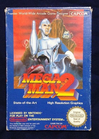
Seriously, what is this I don't even
Re: Classic box art ruined by localisation
MM1 is more heinous IMO. It legitimately looks like an elementary school kid's drawing. PAL MM2's is just weird and out there.
@trap0xf | daifukkat.su/blog | scores | FIRE LANCER
<S.Yagawa> I like the challenge of "doing the impossible" with older hardware, and pushing it as far as it can go.
<S.Yagawa> I like the challenge of "doing the impossible" with older hardware, and pushing it as far as it can go.

Re: Classic box art ruined by localisation
That Beyond Oasis cardboard box: it's so ugly I had no difficulty finding one in perfect shape, IIRC back in 2010.
(I needed only the US cart but since it came boxed, heh)
(I needed only the US cart but since it came boxed, heh)
Strikers1945guy wrote:"Do we....eat chicken balls?!"
-
null1024
- Posts: 3823
- Joined: Sat Dec 15, 2007 8:52 pm
- Location: ʍoquıɐɹ ǝɥʇ ɹǝʌo 'ǝɹǝɥʍǝɯos
- Contact:
Re: Classic box art ruined by localisation
Man, I like MM2's PAL cover, freaky as it is. It's not good, but it's likable. It's not fundamentally awful like the MM1 US box.
That doesn't excuse the fact that it has no business being the cover of a Mega Man game, bearing the vaguest resemblance to something MM related.
I'm genuinely curious as to why the fuck any of this was allowed. The artists clearly haven't so much as gotten ANY visual support of what they should be aiming for in some cases.
It's like the entirety of the conversation went:
C: "so, draw the box for Mega Man 2"
A: "okay, what am I aiming for?"
C: "he's a robot with a laser cannon for an arm that's fighting evil"
A: "anything els-"
and then the phone hung up and the artist drew this and sent it in and got paid
Come check out my website, I guess. Random stuff I've worked on over the last two decades.

Re: Classic box art ruined by localisation
Speaking of Mega Man art, there was obviously this just...perverse need to be special even when they switched over to more-natural art in 4. Witness the differences between the US and "Europa" covers: Mega Man's face looks more tanned and sculpted (ew) in the US one, as apparently the original art was sloppily airbrushed over.
Killer7's PAL tries to show off each character, almost as if they're measured up in a police line - actually, they're just sort of hesitantly ambling towards the foreground. While the suggestion of different personalities and hesitation from the supporting cast seems alright, trying to make too much out of the relative physical dimensions of the characters is actually against the entire aesthetic intention of the game, as memory serves. It doesn't matter if you're playing as the kid or the wrestler - the game's camera and perspective shifts and tracks each character so you don't feel one is large or small as you're using them. In their shoes - or barefoot - everybody is a commanding presence. Their specific characteristics ultimately differentiate them (along with the rather unstable progression of the blood leveling mechanic, this is the part where the game probably teeters the most - I know that there are long stretches of the game where you'll prefer one character over others, and only the special abilities ease you into using them all - but I'm getting off topic).
For comparison, the US cover shows the cracks in a pane of glass from a bullet shot (thematically appropriate, and executed in the style of the game) splitting the view into slots for each of the character's portraits - a more meaningful representation of the game experience, and it also happily avoids some of the awkward postures seen in the PAL cover (poor Kaede).
Harman is there in the US cover - but barely visible, as fits his rather mysterious position within the organization. The PAL cover calls too much attention to him; worse, his shading there makes him look more like a generic Man With No Name, Now In A Home type than himself, which is also unfortunate. Again, the PAL cover can't decide what it wants to do with the stylistic choices of the game - the outlines often don't make sense without enough shading detail, or the full image - yet the portraits are intended to be just as striking and possibly representative of the characters.
Long story short, the PAL cover sucks, and the US one is actually pretty good. Perhaps something about it seems formulaic or conventional, but actually it's the PAL cover that resembles an Ocean's Eleven cover or (insert your favorite "moody heroes walk in front of an uncompromisingly stark landscape" movie poster design here).
It's a long way from the 'aughts, but my memory of picking this game up at the store was of that US cover clinching the sale - given that I had already known the game was getting good word-from-forums I would have bought it even if presented with the lousy PAL cover. But that cover was just vague and stylish enough to yell "this ain't like that Resident Evil 4 you've been enjoying, but it'll be a trip all the same." Uncompromising, too. Admittedly, every cover style for the game gives up on attempting to portray many of the elements that make the game so compelling; the typical "mess of heads and some stylized locale scenery" would have probably been a good fit here. I'm not sure that the US cover alone would have sold me on the game - I mean, how? $30 or so was still real money back then - but the PAL cover isn't making the sale either.
Capcom is dead, long live Capcom.

Blanka: WOOD IS MY DRUG
I know it's just this particular cover's long service life, but man, that sawdust is going straight up his nose man
Meanwhile, Ryu kept his eyes on the prize but his only reward was a foot in his mouth. Maybe. Ryu's mouth is the abyss, especially with a flashing orange arrow pointed right at it.
Can't lie, the US cover has always delighted due to its unique combination of energetic silliness (VIBRATORY ECTO-COOLER FLAVORED SPEED LINES, speaking of drugs) and also being iconic. Nothing against the classic Capcom JPN illustration team here, but yeah that composition ain't great and that leaves the JPN cover rather forgettable.
The only one of the Capcom Five (four released) covers that I felt was really strikingly different, and possibly better, with the PAL release is the Resident Evil 4 one. (P.N. 03's PAL cover composition isn't quite as strong and there's no hand-fu going on, sadness. Viewtiful Joe's PAL cover has a more striking color scheme, but the city in the backdrop has lost all its color; the composition is otherwise a close match for the US one.)Immryr wrote:I think the pal [Killer7] cover is the best of the bunch here.
http://img.gamefaqs.net/box/4/8/2/19482_front.jpg
Killer7's PAL tries to show off each character, almost as if they're measured up in a police line - actually, they're just sort of hesitantly ambling towards the foreground. While the suggestion of different personalities and hesitation from the supporting cast seems alright, trying to make too much out of the relative physical dimensions of the characters is actually against the entire aesthetic intention of the game, as memory serves. It doesn't matter if you're playing as the kid or the wrestler - the game's camera and perspective shifts and tracks each character so you don't feel one is large or small as you're using them. In their shoes - or barefoot - everybody is a commanding presence. Their specific characteristics ultimately differentiate them (along with the rather unstable progression of the blood leveling mechanic, this is the part where the game probably teeters the most - I know that there are long stretches of the game where you'll prefer one character over others, and only the special abilities ease you into using them all - but I'm getting off topic).
For comparison, the US cover shows the cracks in a pane of glass from a bullet shot (thematically appropriate, and executed in the style of the game) splitting the view into slots for each of the character's portraits - a more meaningful representation of the game experience, and it also happily avoids some of the awkward postures seen in the PAL cover (poor Kaede).
Harman is there in the US cover - but barely visible, as fits his rather mysterious position within the organization. The PAL cover calls too much attention to him; worse, his shading there makes him look more like a generic Man With No Name, Now In A Home type than himself, which is also unfortunate. Again, the PAL cover can't decide what it wants to do with the stylistic choices of the game - the outlines often don't make sense without enough shading detail, or the full image - yet the portraits are intended to be just as striking and possibly representative of the characters.
Long story short, the PAL cover sucks, and the US one is actually pretty good. Perhaps something about it seems formulaic or conventional, but actually it's the PAL cover that resembles an Ocean's Eleven cover or (insert your favorite "moody heroes walk in front of an uncompromisingly stark landscape" movie poster design here).
It's a long way from the 'aughts, but my memory of picking this game up at the store was of that US cover clinching the sale - given that I had already known the game was getting good word-from-forums I would have bought it even if presented with the lousy PAL cover. But that cover was just vague and stylish enough to yell "this ain't like that Resident Evil 4 you've been enjoying, but it'll be a trip all the same." Uncompromising, too. Admittedly, every cover style for the game gives up on attempting to portray many of the elements that make the game so compelling; the typical "mess of heads and some stylized locale scenery" would have probably been a good fit here. I'm not sure that the US cover alone would have sold me on the game - I mean, how? $30 or so was still real money back then - but the PAL cover isn't making the sale either.
Capcom is dead, long live Capcom.
Blanka: WOOD IS MY DRUG
I know it's just this particular cover's long service life, but man, that sawdust is going straight up his nose man
Meanwhile, Ryu kept his eyes on the prize but his only reward was a foot in his mouth. Maybe. Ryu's mouth is the abyss, especially with a flashing orange arrow pointed right at it.
Can't lie, the US cover has always delighted due to its unique combination of energetic silliness (VIBRATORY ECTO-COOLER FLAVORED SPEED LINES, speaking of drugs) and also being iconic. Nothing against the classic Capcom JPN illustration team here, but yeah that composition ain't great and that leaves the JPN cover rather forgettable.
-
GaijinPunch

- Posts: 15845
- Joined: Mon Jan 31, 2005 11:22 pm
- Location: San Fransicso
Re: Classic box art ruined by localisation
Unbelievable it took until page 2 to get to Mega Man.
RegalSin wrote:New PowerPuff Girls. They all have evil pornstart eyelashes.
Re: Classic box art ruined by localisation
Rokkuman's elderly, bowlegged NES stand-in was embargoed in the first post, but he exploited his Bad Boxart connections to schmooze his way in anyway.
光あふれる 未来もとめて, whoa~oh ♫
[THE MIRAGE OF MIND] Metal Black ST [THE JUSTICE MASSACRE] Gun.Smoke ST [STAB & STOMP]
-
apatheticTurd

- Posts: 116
- Joined: Fri Apr 08, 2011 11:12 am
Re: Classic box art ruined by localisation
Considering how well-know Mega Man's cover his, I'm surprised the hilarious back cover doesn't have the same level of infamy. Did you know Rockman really is about a weaponized Übermensch protecting the gene pool from being polluted by cocksucking mutants?

WOW!
WOW!
-
Squire Grooktook

- Posts: 5997
- Joined: Sat Jan 12, 2013 2:39 am
Re: Classic box art ruined by localisation
Mega Man, WOW!
Aeon Zenith - My STG.RegalSin wrote:Japan an almost perfect society always threatened by outsiders....................
Instead I am stuck in the America's where women rule with an iron crotch, and a man could get arrested for sitting behind a computer too long.
Re: Classic box art ruined by localisation
Mega Penetration: The Racial Purificationing
光あふれる 未来もとめて, whoa~oh ♫
[THE MIRAGE OF MIND] Metal Black ST [THE JUSTICE MASSACRE] Gun.Smoke ST [STAB & STOMP]
Re: Classic box art ruined by localisation
Who the flying fuck is that Grand Wizard on the back supposed to be? Nice gold medallions, dude. (Not one, but two, flappin' in the breeze!)
Suddenly I got some respect back for the apes at Konami USA. Koranot I can abide, but this...auuu, not so rough ;_;
Sunnydale, CA...guess we always had our suspicions.
Suddenly I got some respect back for the apes at Konami USA. Koranot I can abide, but this...auuu, not so rough ;_;
Sunnydale, CA...guess we always had our suspicions.
Re: Classic box art ruined by localisation
Indeed, Konami USA/ULTRA GAMEZ usually meant decent boxart and AWESOMEly bad MANUALS
"How do we know that all our soldiers have been brain trashed? You can see it in their eyes."

WINNERS DONT USE DRUGS KIDS
"How do we know that all our soldiers have been brain trashed? You can see it in their eyes."
WINNERS DONT USE DRUGS KIDS
光あふれる 未来もとめて, whoa~oh ♫
[THE MIRAGE OF MIND] Metal Black ST [THE JUSTICE MASSACRE] Gun.Smoke ST [STAB & STOMP]
Re: Classic box art ruined by localisation
He was Capcom's mascot in the early NES days, Captain Commando. He was on the game manuals for some of Capcom's earlier games.Ed Oscuro wrote:Who the flying fuck is that Grand Wizard on the back supposed to be? Nice gold medallions, dude. (Not one, but two, flappin' in the breeze!)
Re: Classic box art ruined by localisation
Yeah I saw the CC but that's NOT the Cap'n...it's some kind of silver haired klan impostor I think.
Fun fact: プレイ can be rearranged into レイプ!BIL wrote:Indeed, Konami USA/ULTRA GAMEZ usually meant decent boxart and AWESOMEly bad MANUALS
"How do we know that all our soldiers have been brain trashed? You can see it in their eyes."
http://imageshack.com/a/img809/3522/1nlx.png
WINNERS DONT USE DRUGS KIDS