http://www.gamestop.com/product.asp?product%5Fid=220576
They seem to have gone for the Star Warsy look on the ships .. but not a bad mock up.
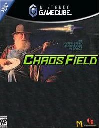
Chaos Field US Boxart.... Not bad
-
Kiken

- Posts: 3991
- Joined: Tue Jan 25, 2005 11:08 pm
- Contact:

-
captain ahar

- Posts: 3182
- Joined: Wed Jan 26, 2005 10:03 pm
- Location: #50 Bitch!
-
professor ganson

- Posts: 5193
- Joined: Mon Feb 21, 2005 3:59 am
- Location: OHIO
-
crithit5000

- Posts: 925
- Joined: Thu Jan 27, 2005 3:17 am
- Location: Youngstown OH, USA
- Contact:

-
superhitachi4

- Posts: 379
- Joined: Thu Apr 14, 2005 11:30 pm
- Location: RLC Jr.

-
U K Narayan

- Posts: 145
- Joined: Wed Jan 26, 2005 2:25 am
- Location: Denver, CO
-
BulletMagnet

- Posts: 14420
- Joined: Wed Jan 26, 2005 4:05 am
- Location: Wherever.
- Contact:

-
Nullsleep

- Posts: 146
- Joined: Wed Aug 03, 2005 12:47 am
- Location: New York
- Contact:


-
umi

- Posts: 266
- Joined: Thu Jan 27, 2005 1:55 am
Chaos Field US boxart... NOT GOOD, EITHER!
Words fail to describe... the tackiness of that logo. Surprisingly, someone was paid to design that (simultaneously desecrating the kickass jap logo). The ships are... okay I guess. Generic, but then the in-game ships are kinda generic too -- Definitely not bad. It's funny , I thought box art was meant to *attract* potential players :P I love the original CF logo, it looks like a piece of kickass graffiti. One would think that would appeal more to Americans... but then, it is creative, so no, doesn't fit into the American market at all :P
Words fail to describe... the tackiness of that logo. Surprisingly, someone was paid to design that (simultaneously desecrating the kickass jap logo). The ships are... okay I guess. Generic, but then the in-game ships are kinda generic too -- Definitely not bad. It's funny , I thought box art was meant to *attract* potential players :P I love the original CF logo, it looks like a piece of kickass graffiti. One would think that would appeal more to Americans... but then, it is creative, so no, doesn't fit into the American market at all :P
-
Zweihander

- Posts: 1363
- Joined: Tue May 17, 2005 8:10 am
- Location: US
Fixed:Kiken wrote:Chaos Field US Boxart.... Not bad
Chaos Field US Boxart.... Very bad
......but Chaos Field was a shit game anyway.
With all seriousness, the artwork itself is fine, but that Starfox font... *shudder* Makes me glad I'm not a Chaos Field fanboy; if i was, then I might be concerned.

Schrodinger's cat wrote:Yeah, "shmup" really sounds like a term a Jewish grandmother would insult you with.

-
gameoverDude

- Posts: 2269
- Joined: Wed Jan 26, 2005 12:28 am
- Contact:
It may not be as good as the Japanese boxart, but it's still no total loss. At least it's no Mobile Light Force 3.
The logo font looks very Nintendo-y and probably should have been colored metallic silver or gold. Hopefully they'll keep the original Japanese logo in the game's title screen.
Anyway it's great to see this arriving here even though I've got the DC version. I'll likely grab it.
The logo font looks very Nintendo-y and probably should have been colored metallic silver or gold. Hopefully they'll keep the original Japanese logo in the game's title screen.
Anyway it's great to see this arriving here even though I've got the DC version. I'll likely grab it.
Kinect? KIN NOT.
-
Zweihander
- Posts: 1363
- Joined: Tue May 17, 2005 8:10 am
- Location: US
Um.. leave the boxart exactly the same...?Kingbuzzo wrote:There isn't exactly a Milestone of America, so they probably had not idea what to do :p
Seriously, seeing the title screen (on the shmups.com review) was incentive enough for me to download the game. It even fooled me into thinking the game would be decent. o__O
Schrodinger's cat wrote:Yeah, "shmup" really sounds like a term a Jewish grandmother would insult you with.
-
JBC

- Posts: 3850
- Joined: Wed Mar 30, 2005 3:14 am
Gee... that doesn't look just like every other game you see dishevled amongst the rest of the bargain bin trash - covered in dust and sticky fingerprints. That really dynamic Chaos Field logo the japanese got would never go over well in america - especially since we prefer bland sci-fi fonts and hate graffiti. I mean - go look around any city in the country and you can totally tell that we HATE graffiti style lettering. I really think the bland lettering helps to accentuate the 'Chaos' part of the title.
Oh, wait... No.
Honestly, i think it needs more old men with banjos.
Oh, wait... No.
Honestly, i think it needs more old men with banjos.
-
Sly Cherry Chunks

- Posts: 1993
- Joined: Mon Feb 28, 2005 8:40 pm
- Location: Colin's Bargain Basement. Everything must go.
-
BulletMagnet
- Posts: 14420
- Joined: Wed Jan 26, 2005 4:05 am
- Location: Wherever.
- Contact:
-
theevilfunkster

- Posts: 950
- Joined: Tue Feb 01, 2005 3:49 pm
- Location: Glossop, UK
-
Sly Cherry Chunks
- Posts: 1993
- Joined: Mon Feb 28, 2005 8:40 pm
- Location: Colin's Bargain Basement. Everything must go.
-
theevilfunkster
- Posts: 950
- Joined: Tue Feb 01, 2005 3:49 pm
- Location: Glossop, UK
-
BulletMagnet
- Posts: 14420
- Joined: Wed Jan 26, 2005 4:05 am
- Location: Wherever.
- Contact:
-
Zweihander
- Posts: 1363
- Joined: Tue May 17, 2005 8:10 am
- Location: US
-
ROBOTRON

- Remembered
- Posts: 1670
- Joined: Wed Jun 01, 2005 4:36 pm
- Location: Eastpointe, MI...WE KILL ALIENS.
- Contact:

-
Thunder Force

- Posts: 1773
- Joined: Wed Jan 26, 2005 11:21 am
- Location: research and development facility for Vasteel Technology.