Video Game Artwork
-
xbl0x180

- Posts: 2117
- Joined: Mon Jul 04, 2011 5:28 pm
Re: Video Game Artwork
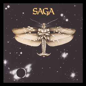
Some of these look like late 70s and 80s Prog Rock album covers... like those old Saga records hahah 
-
Sly Cherry Chunks

- Posts: 1996
- Joined: Mon Feb 28, 2005 8:40 pm
- Location: Colin's Bargain Basement. Everything must go.
Re: Video Game Artwork
Were they prints or the actual original artwork?Stefan_L wrote:I bought the Katakis artwork from him (plus crimetime and turrican 2)
-
Stefan_L

- Posts: 270
- Joined: Sat Mar 12, 2005 5:29 pm
- Location: Sweden
- Contact:
Re: Video Game Artwork
It was the originals i bought from Celal (and the others).
-
Sly Cherry Chunks
- Posts: 1996
- Joined: Mon Feb 28, 2005 8:40 pm
- Location: Colin's Bargain Basement. Everything must go.
-
neorichieb1971
- Posts: 8024
- Joined: Wed Jan 26, 2005 1:28 am
- Location: Bedford, UK
- Contact:
Re: Video Game Artwork
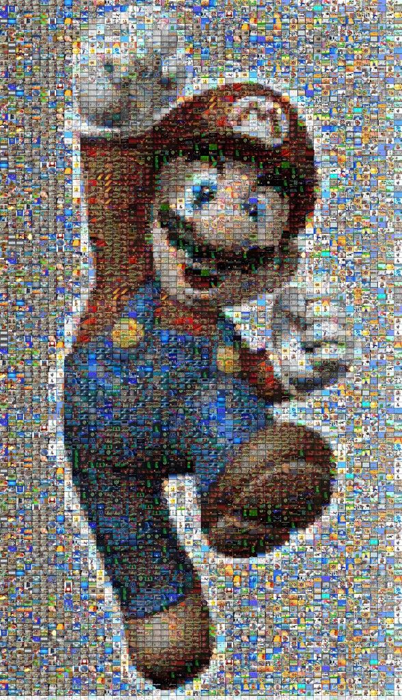
Mosaic of Mario. Each tile is a screenshot of a mario game. Amazing!
File is JPEG at 6.2mb.
This industry has become 2 dimensional as it transcended into a 3D world.
-
BIL

- Posts: 20427
- Joined: Thu May 10, 2007 12:39 pm
- Location: COLONY
Re: Video Game Artwork
Semi-OT but I can't resist posting it here.

Lord have mercy some of SNK's pixel art was too fucking good.
>MVS fighting game background porn<
Lord have mercy some of SNK's pixel art was too fucking good.
>MVS fighting game background porn<

光あふれる 未来もとめて, whoa~oh ♫
[THE MIRAGE OF MIND] Metal Black ST [THE JUSTICE MASSACRE] Gun.Smoke ST [STAB & STOMP]
-
Op Intensify
- Posts: 1090
- Joined: Sun Apr 29, 2012 2:19 am
Re: Video Game Artwork
There's a redrawn version of this stage in KOF XIII.Semi-OT but I can't resist posting it here.
-
Stormwatch

- Posts: 2327
- Joined: Thu Jan 27, 2005 1:04 am
- Location: Brazil
- Contact:


-
Obiwanshinobi

- Posts: 7564
- Joined: Sun Jul 26, 2009 1:14 am
Re: Video Game Artwork
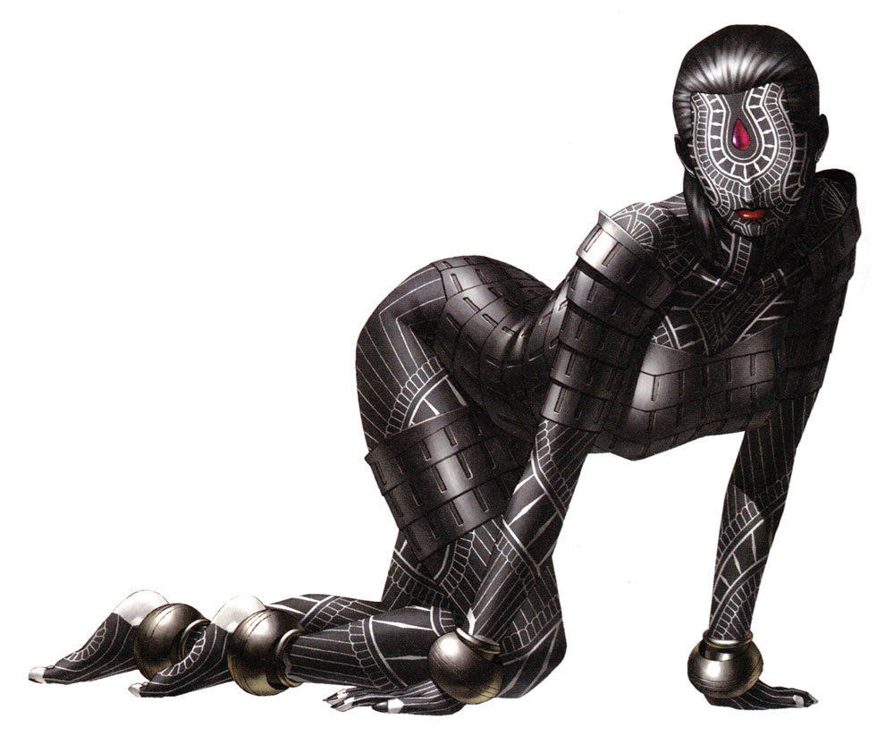
I don't even like the "superhero suit" design, but this is such a fine artwork:

The rear gate is closed down
The way out is cut off

The way out is cut off
-
MOSQUITO FIGHTER

- Posts: 1745
- Joined: Sat Aug 13, 2005 7:32 pm
Re: Video Game Artwork
Dark Souls art, pretty nice.

Uploaded with ImageShack.us

Uploaded with ImageShack.us
More here http://www.giantbomb.com/dark-souls/61- ... 52-479540/
I think they did a really good job of rendering the concept art into the game.

Uploaded with ImageShack.us

Uploaded with ImageShack.us
More here http://www.giantbomb.com/dark-souls/61- ... 52-479540/
I think they did a really good job of rendering the concept art into the game.
-
JBueno MD

- Posts: 131
- Joined: Fri Jul 16, 2010 5:45 am
- Location: Mexico City
Re: Video Game Artwork
God I miss the 90s, SNK was the best.BIL wrote:Semi-OT but I can't resist posting it here.
Lord have mercy some of SNK's pixel art was too fucking good.

-
ED-057

- Posts: 1560
- Joined: Fri Jan 28, 2005 7:21 am
- Location: USH
Re: Video Game Artwork
Looks good, but I find it a bit curious that, in a wide open desert, someone apparently chose to build a gas station next to the railroad tracks instead of next to the road. And there is a sign for a railroad crossing, but no actual crossingJBueno MD wrote:God I miss the 90s, SNK was the best.
-
Stefan_L
- Posts: 270
- Joined: Sat Mar 12, 2005 5:29 pm
- Location: Sweden
- Contact:
Re: Video Game Artwork
Philippe Cazaumayou (Caza) did some good game box artwork:


-
BIL
- Posts: 20427
- Joined: Thu May 10, 2007 12:39 pm
- Location: COLONY
Re: Video Game Artwork
According to the Engrish-modified crossing sign, its railroad has long since been "crosed." I guess the current one is meant to be out of use too, hence the gas station. And that lawn chair a few feet from it.ED-057 wrote:And there is a sign for a railroad crossing, but no actual crossing
光あふれる 未来もとめて, whoa~oh ♫
[THE MIRAGE OF MIND] Metal Black ST [THE JUSTICE MASSACRE] Gun.Smoke ST [STAB & STOMP]
-
MOSQUITO FIGHTER
- Posts: 1745
- Joined: Sat Aug 13, 2005 7:32 pm
Re: Video Game Artwork
The train runs on gas.
-
emphatic

- Posts: 8037
- Joined: Mon Aug 18, 2008 3:47 pm
- Location: Alingsås, Sweden
- Contact:
Re: Video Game Artwork

 | My games - http://www.emphatic.se
RegalSin wrote:Street Fighters. We need to aviod them when we activate time accellerator.
-
Obiwanshinobi
- Posts: 7564
- Joined: Sun Jul 26, 2009 1:14 am

-
BIL
- Posts: 20427
- Joined: Thu May 10, 2007 12:39 pm
- Location: COLONY
Re: Video Game Artwork
^Oh hell yes. Baraduke's poster is a favourite of mine... perfect interpretation of the game's action. The game itself has quite an atmosphere too. For all the slight goofiness of its chubby sprites, those are some fucked-up looking monsters.
光あふれる 未来もとめて, whoa~oh ♫
[THE MIRAGE OF MIND] Metal Black ST [THE JUSTICE MASSACRE] Gun.Smoke ST [STAB & STOMP]
-
Obiwanshinobi
- Posts: 7564
- Joined: Sun Jul 26, 2009 1:14 am
Re: Video Game Artwork
The Pac-Man thing ftw. I guess pretty much all sprites and tiles are 32x32, hence the chubbyness.

The rear gate is closed down
The way out is cut off
The way out is cut off
-
Formless God

- Posts: 671
- Joined: Fri Mar 12, 2010 7:46 am
Re: Video Game Artwork
Kazuma Kaneko
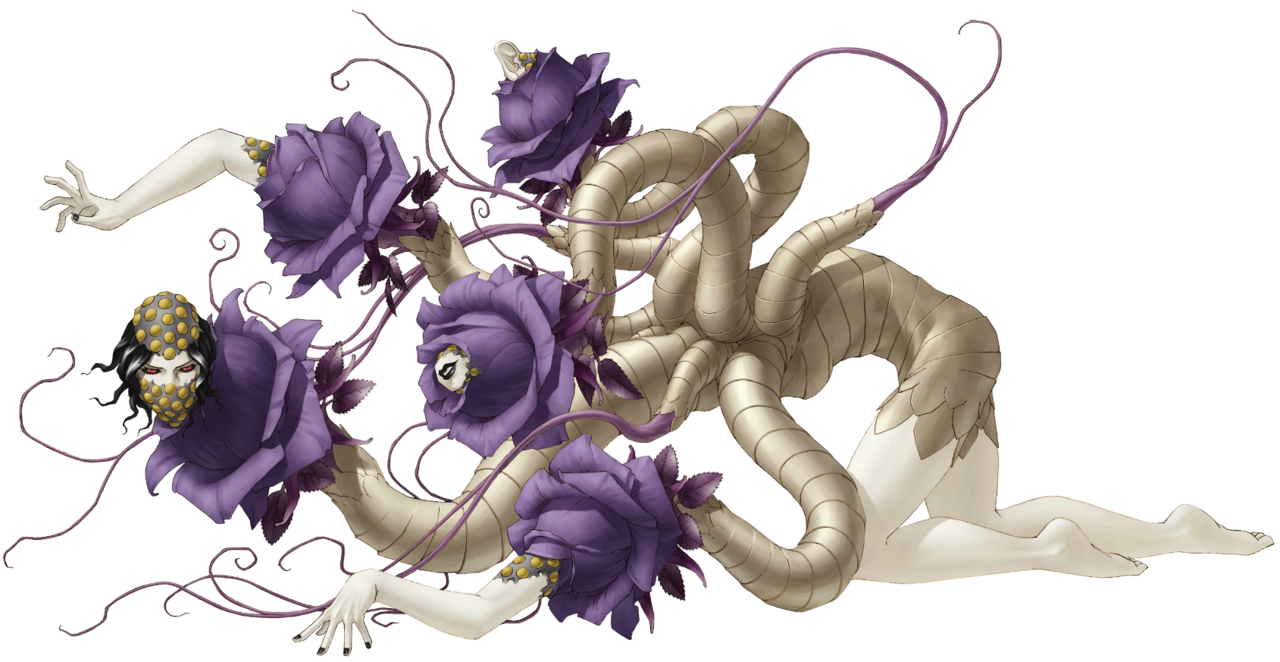
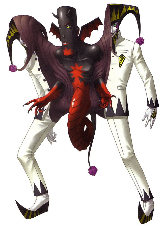
Suzuhito Yasuda

also +1 for Range Murata, Shanghai Alice and the Otomedius guy
Suzuhito Yasuda
also +1 for Range Murata, Shanghai Alice and the Otomedius guy
RegalSin wrote:Then again sex is no diffrent then sticking a stick down some hole to make a female womenly or girl scream or make noise.
-
CMoon

- Posts: 6207
- Joined: Tue Jan 25, 2005 10:28 pm
Re: Video Game Artwork
Unfortunately the message I'm getting from this thread (intended or not) is how sorry as fuck US game covers are. At first I thought that back in the 70's & 80's they simply needed great covers to help the gamer imagine that pile of pixels was some awesome spaceship, but just look at some of the art in this thread from only a few years ago. Do publishers just assume all US gamers are attracted to butt ugly covers?
Anyway, here's some of those Intellivision covers you've seen before that set a really high bar for video game art:
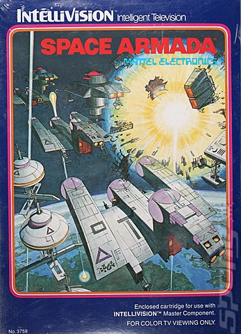
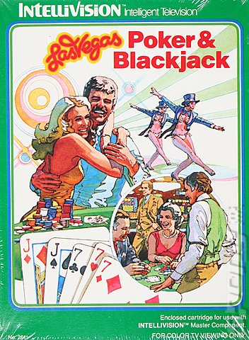
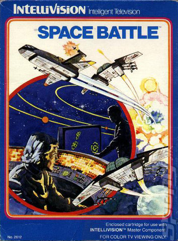
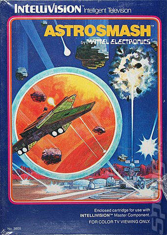
Anyway, here's some of those Intellivision covers you've seen before that set a really high bar for video game art:
SHMUP sale page.Randorama wrote:ban CMoon for being a closet Jerry Falwell cockmonster/Ann Coulter fan, Nijska a bronie (ack! The horror!), and Ed Oscuro being unable to post 100-word arguments without writing 3-pages posts.
Eugenics: you know it's right!
-
BIL
- Posts: 20427
- Joined: Thu May 10, 2007 12:39 pm
- Location: COLONY
Re: Video Game Artwork
I've been thinking similarly since getting into the Mega Drive. So many games I remember having dog-ugly boxes as a kid have beautiful cover art in their native format.
Assault Suit Leynos, Strider and Shadow Dancer all got bludgeoned with the ugly boxart stick too. El Viento is probably my favourite example of this unfortunate practice.
Assault Suit Leynos, Strider and Shadow Dancer all got bludgeoned with the ugly boxart stick too. El Viento is probably my favourite example of this unfortunate practice.
光あふれる 未来もとめて, whoa~oh ♫
[THE MIRAGE OF MIND] Metal Black ST [THE JUSTICE MASSACRE] Gun.Smoke ST [STAB & STOMP]
-
emphatic
- Posts: 8037
- Joined: Mon Aug 18, 2008 3:47 pm
- Location: Alingsås, Sweden
- Contact:
Re: Video Game Artwork

 | My games - http://www.emphatic.se
RegalSin wrote:Street Fighters. We need to aviod them when we activate time accellerator.
-
drauch

- Posts: 5671
- Joined: Thu Oct 30, 2008 6:14 am
Re: Video Game Artwork
Whoa, whoa, hold up now! Both of those Alisia Dragoon covers rule! Might be my infatuation with fantasy art, though.
BIL wrote: "Small sack, LOTS OF CUM" - Nikola Tesla
-
BIL
- Posts: 20427
- Joined: Thu May 10, 2007 12:39 pm
- Location: COLONY
Re: Video Game Artwork
It's more the US one being completely unrepresentative of the character that I dislike, really - it's far from the worst cover on its own merits. I like Vallejo-style stuff too.
El Viento's US illustration of that game's protagonist is a true abomination.
El Viento's US illustration of that game's protagonist is a true abomination.
光あふれる 未来もとめて, whoa~oh ♫
[THE MIRAGE OF MIND] Metal Black ST [THE JUSTICE MASSACRE] Gun.Smoke ST [STAB & STOMP]
-
drauch
- Posts: 5671
- Joined: Thu Oct 30, 2008 6:14 am
Re: Video Game Artwork
^Hahahaha, oh god, yeah; that El Viento is so horrendous. And yeah, you're certainly right about Alisia Dragoon. Cool picture, but certainly doesn't fit the character.
BIL wrote: "Small sack, LOTS OF CUM" - Nikola Tesla
-
BIL
- Posts: 20427
- Joined: Thu May 10, 2007 12:39 pm
- Location: COLONY
Re: Video Game Artwork
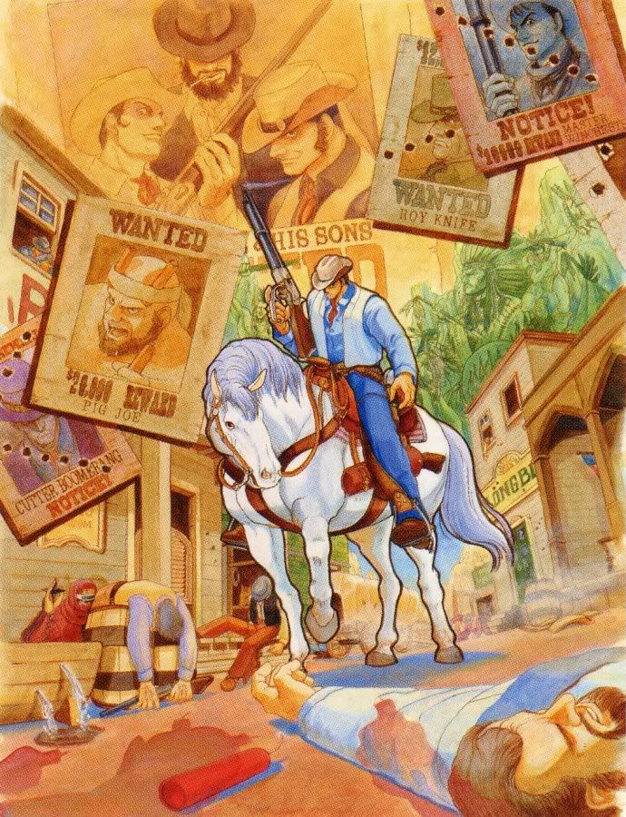
Badass. As you'd expect from a Cowboy Shooter. Check out Wolf Chief in the background and Pig Joe's looming shadow with TNT in hand! And that sneaky prick Ninja.
光あふれる 未来もとめて, whoa~oh ♫
[THE MIRAGE OF MIND] Metal Black ST [THE JUSTICE MASSACRE] Gun.Smoke ST [STAB & STOMP]
-
Shelcoof

- Posts: 1530
- Joined: Mon Nov 03, 2008 9:36 pm
- Location: Canada
Re: Video Game Artwork
Wish I had time to post up some Shenmue and Panzer Dragoon Art. Here`s a quick link to Panzer Dragoon http://art.thewilloftheancients.com/home.htm
-
xbl0x180
- Posts: 2117
- Joined: Mon Jul 04, 2011 5:28 pm
Re: Video Game Artwork
The cover looks hot. I NEED THIS!BIL wrote:
-
BareKnuckleRoo

- Posts: 6958
- Joined: Mon Oct 03, 2011 4:01 am
- Location: Southern Ontario
Re: Video Game Artwork
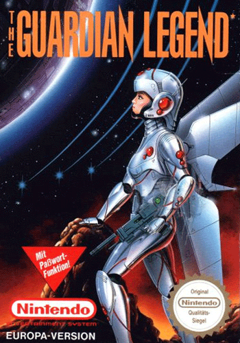
Naoyuki Kato's cover for Guardic Gaiden is one of my faves ever.
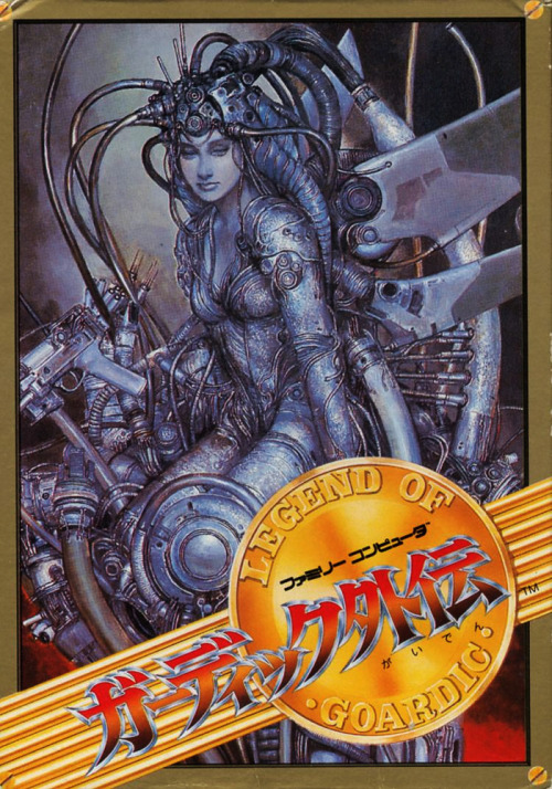
The covers for the ports are appalling by comparison. American one's a ripoff of a movie poster and the euro one's pretty bland when compared to the original.

The covers for the ports are appalling by comparison. American one's a ripoff of a movie poster and the euro one's pretty bland when compared to the original.