Hmm. The GUI is clunky. Lots of wasted space on the screen, clicking the dials is slow, and it's a tad hard to read because of the Script-style font used. However kudos to you for including a lot of good options in there at this point. I suggest streamlining the options menu and putting everything in table format, like this:

In fact, since your game is steampunk, I suggest looking at
the game where that menu came from for references. The first post in the link has a bunch of videos you can download, and there are more on YouTube.
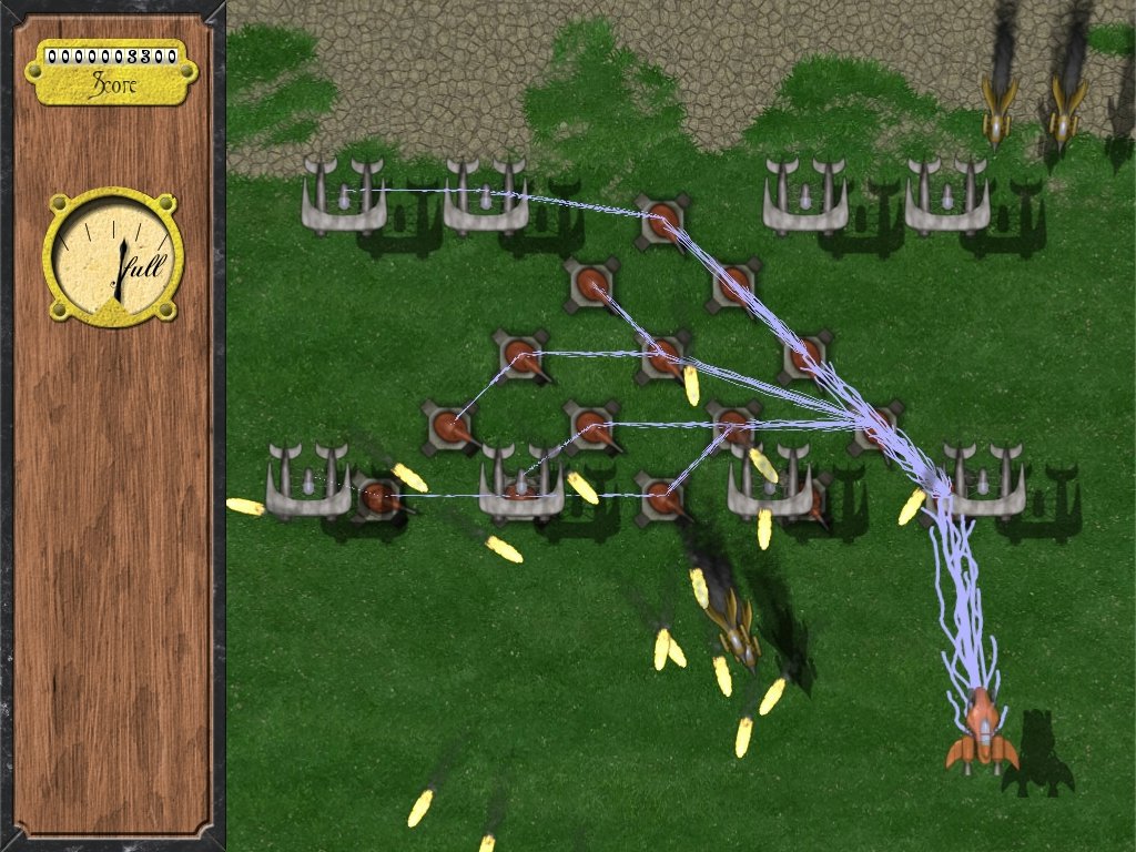
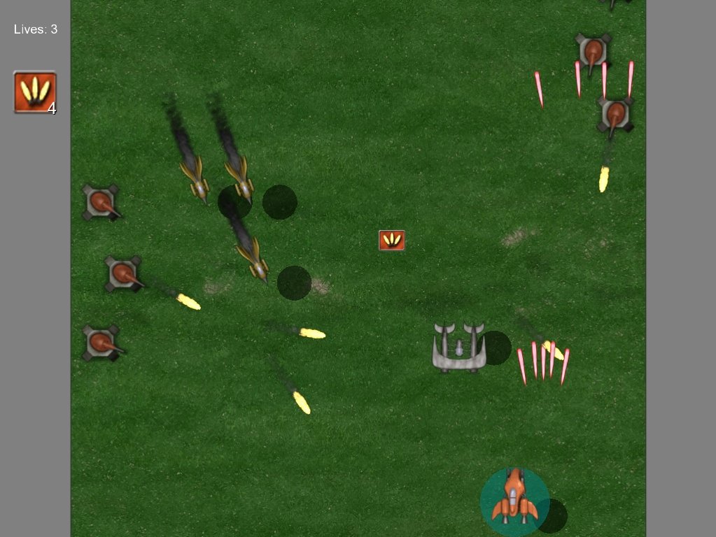
As for the game itself, I didn't experience any slowdowns on my machine. However, the whole thing just feels off. I know this is just an alpha or a prototype, but everything is too static, slow and monotonous, and the designs are boring.
One reason would be the proportion of the sprites--at this point they're a bit too small, with the large grey planes seeming like popcorns compared to your ship, and the ground turrets being a LOT smaller. Another reason is the flight patterns. Right now the missiles are interesting to look at compared to the grey planes because they curve toward your ship and move fast, but the grey planes need a lot of work. Try making them come in from the sides, follow curved paths, fly at you in a formation and then break away to the sides as soon as they come near, fly down in a sine-wave path, etc. to liven up the action.
Also, as for that boss...try not to make him edge down to the bottom of the screen so much. Maybe fly down there for a bit, then quickly go back up again (as opposed to lingering around for a long while, forcing me to pointblank him to score the kill).


 | My games -