Just... something epic about it. IMO, in the case of the X68000 version, the cover art > the game. Whether or not Pharmer Bob's cover is superior to the actual game is debatable. (I'd vouch for that, though)
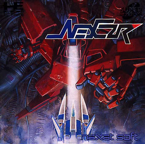
On a less-ridiculous note, if I had to choose an all-time favorite shmup cover, it would be this:
DOJ poster/cover art set an insanely high bar for cover art in my book, shmup or non. IMO the Japanese Einhander cover comes close on the level of artistic simplicity, yet doesn't even scratch the surface for symbolism. Then again, to be fair, DOJ's story and underlying themes were a bit deeper than Einhander's. The covers for both got the job done perfectly.
Schrodinger's cat wrote:Yeah, "shmup" really sounds like a term a Jewish grandmother would insult you with.
Phalanx's X68000 cover is epic and you don't really get the full effect from that tiny image. True highrez. The SNES pic is also truly epic. The SFC pic looks pretty shit from here.
Space Manbow is alright!
Crisis Force is alright!
some Konami game art is better than the game itself i.e. axelay
some isn't though, like Nemesis '90 Kai
Battle Mania (Japanese) is alright!
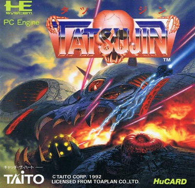
Tatsujin II (FM Towns) is alright!
Undead Line (X68000 / MSX) are alright!
I always kinda had a weak spot for the GG Aleste 2 box.
Last edited by Ed Oscuro on Thu Apr 09, 2009 2:10 am, edited 1 time in total.
kinda interesting composition from an artsty point of view though.
Phalanx's X68000 cover is epic and you don't really get the full effect from that tiny image. True highrez. The SNES pic is also truly epic. The SFC pic looks pretty shit from here.
Space Manbow is alright!
Crisis Force is alright!
Battle Mania (Japanese) is alright!
While the Phalanx ship has always been a phallic reference, the SFC cover does indeed scream "THIS SHIP IS A PENIS". Dare I say, the cover is gayer than the gayest Cho Aniki cover has ever gayed.
EDIT: Also, it saddened me when the GBA port didn't use the Pharmer Bob cover. Still, improved port was improved. You could actually see the bullets.
Schrodinger's cat wrote:Yeah, "shmup" really sounds like a term a Jewish grandmother would insult you with.
Zweihander wrote:EDIT: Also, it saddened me when the GBA port didn't use the Pharmer Bob cover. :( Still, improved port was improved. You could actually see the bullets.
I emulated Phalanx for GBA for like four seconds and almost barfed from how ugly it was. :C
The original Darius poster is sauce, I have it in the cover of my LP (that's vinyl). Not nearly as good as Metal Black's though.
Also I believe there were multiple versions of the Metal Black cover - look at the Saturn versions sometime.
GOD yes. Fukken saved. That Raystorm poster is nobody's bitch, either.
Ed Oscuro wrote:
Zweihander wrote:EDIT: Also, it saddened me when the GBA port didn't use the Pharmer Bob cover. Still, improved port was improved. You could actually see the bullets.
I emulated Phalanx for GBA for like four seconds and almost barfed from how ugly it was. :C
So you didn't like how they made bullets visible this time around...?
Schrodinger's cat wrote:Yeah, "shmup" really sounds like a term a Jewish grandmother would insult you with.
Zweihander wrote:EDIT: Also, it saddened me when the GBA port didn't use the Pharmer Bob cover. :( Still, improved port was improved. You could actually see the bullets.
I emulated Phalanx for GBA for like four seconds and almost barfed from how ugly it was. :C
So you didn't like how they made bullets visible this time around...?
I was just astonished at how ugly it was. Palette choices and such.
The only version of the game I own is the X68000 one, and that I haven't played. So the GBA ver. could well be much superior to the SNES, but I wouldn't want to play that one when I have the "original and best" lying about. Anyway, this is all off-topic, but I hope that helps clear things up.
Ed Oscuro wrote:
I emulated Phalanx for GBA for like four seconds and almost barfed from how ugly it was. :C
So you didn't like how they made bullets visible this time around...?
I was just astonished at how ugly it was. Palette choices and such.
The only version of the game I own is the X68000 one, and that I haven't played. So the GBA ver. could well be much superior to the SNES, but I wouldn't want to play that one when I have the "original and best" lying about. Anyway, this is all off-topic, but I hope that helps clear things up.
Yeah, I get ya. Just saying I prefer the old "white or yellow bullet with a red outline" than a tiny red dot which blends into the reddish or at-times busy background. Invisible Bullet Syndrome, I believe it's referred to as.
Schrodinger's cat wrote:Yeah, "shmup" really sounds like a term a Jewish grandmother would insult you with.
I've always liked Raizing's Mahou series artwork. It's so loud and joyful-looking. I wish I could find a high-res scan of Shippu / Kingdom Grandprix, I love its arcade flyer / Saturn cover.
That's why I have that poster professionally framed and hanging in my living room And get this: it was the wife's idea to put it there (along with my Mars Matrix one)!
ZOM wrote:[Star Trader]
I keep forgetting that I need to play this game!
-ud


Still, improved port was improved. You could actually see the bullets.


 | My games - http://www.emphatic.se


