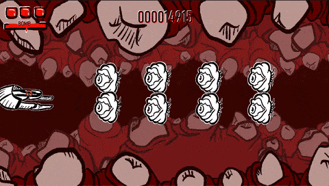
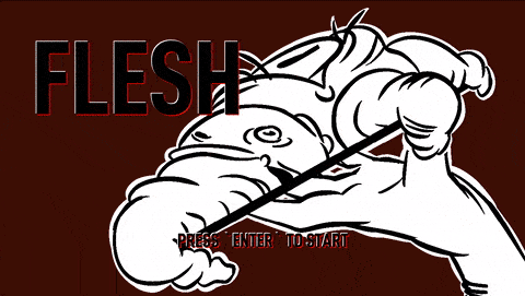
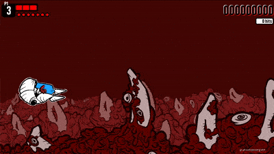
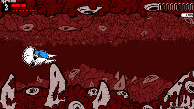
I'm kind of fond of the chunky, large player sprite with small hitbox size aesthetic. There's a several games that do this, such as Battle Traverse.
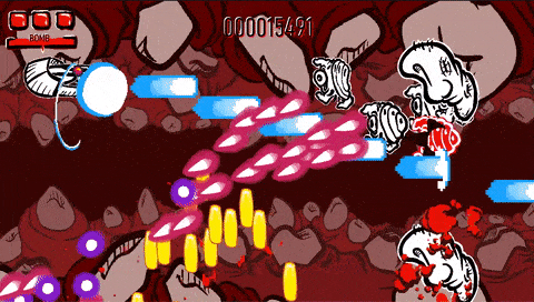
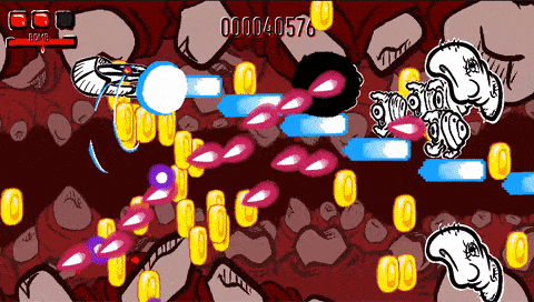
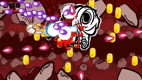
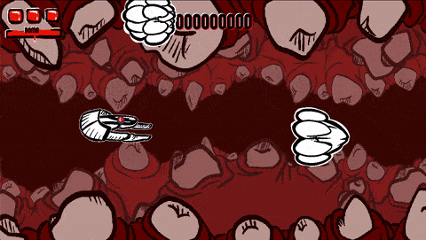
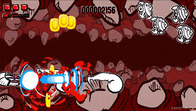
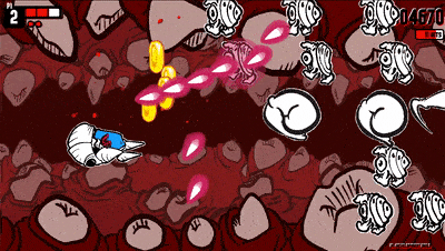
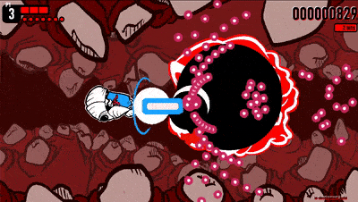
I am curious about bullet colors. If colors too similar. Does it make the player have a difficult time to identify behaviour for each butler types?
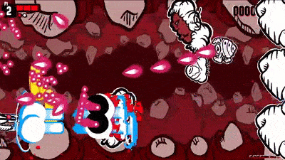
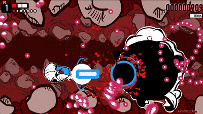
Shmups generally try to use a very limited colour palette for enemy shots, with clear distinctions between attacks. And when player colours overlap with enemy shots (such as red on red), they're of a clearly different shade. Examples include:
• Dodonpachi limits enemy shot colours to pinks and blues. There's one part in the game that has green bullets. Player shot colours consist of orange/red, green, and blue.
• Giga Wing has player shots consisting of Purple, Green, Blue, Red, enemies are limited to Blue and Pink, again with limited green bullets for one or two specific attacks.
• Progear uses nothing but yellow and grey for player shots, with enemy shots being blue.
Generally, limiting yourself to two different colours allows you to make different bullet types look distinct and identifiable, without being too much visual overload like games that do rainbow coloured shots.