Which box art is better?

This is the main shmups forum. Chat about shmups in here - keep it on-topic please!
Post Reply
User avatar
Xonatron
Posts: 658
Joined: Fri Aug 29, 2008 7:01 pm
Location: Nova Scotia, Canada
Contact:

Which box art is better?

Post by Xonatron »

Which box art is better?
(Details of game left out on purpose.)


Image

#33


Image

#34


(P.S. Sore Rush Extended 撃点 thread: http://shmups.system11.org/viewtopic.php?t=55520
Last edited by Xonatron on Fri Jan 22, 2016 2:19 pm, edited 3 times in total.
Matthew Doucette, Xona Games
Score Rush Extended [PS4]: viewtopic.php?t=55520
gray117
Posts: 1235
Joined: Fri Jul 25, 2008 10:19 pm
Location: Leeds

Re: Which box art is better?

Post by gray117 »

Neither...

Composition in 34 looks a little better, with the largish kanji,

...but I'd look at keeping the awards towards the bottom if you're pushing that, and just ditch the ship and balls.

At the moment just looks like a bad ds box on it's side...

#1 japan means nothing... who are your awards from? ... seems to be a bit of wishful interpreting going on here.

But assuming there's some more legit ones on your website I'd put those in a wreath and more clearly state where the awards came from and the year awarded. If you won a cash prize I'd just put winner/or place/category rather than the $ amounts - always rubs people the wrong way - either people think it's too much or too little, can't win. But if you say you placed first or were a winner of something - everyone knows that means best...

Classic mistake of competing with the game title with the large company title - looks desperate. Keep company label smaller/simplier/less intrusive, that whole bottom section could be a list of awards.

You'd probably be better with just something better/more ship like in the background in blue, or a kind of portion/representation of the game in action, and just concentrate on the title more.
User avatar
Strikers1945guy
Posts: 1052
Joined: Wed Aug 13, 2014 1:53 am

Re: Which box art is better?

Post by Strikers1945guy »

I like the layout of 33 more
Mister Midnight wrote:btw, cant trust them Koreans; remember Pearl Harbor
User avatar
Xonatron
Posts: 658
Joined: Fri Aug 29, 2008 7:01 pm
Location: Nova Scotia, Canada
Contact:

Re: Which box art is better?

Post by Xonatron »

Thanks for the feedback. I agree with the "#1 in Japan" "seal" making no sense. I will replace it with a laurel wreath and a better description, mentioning it was #1 in Japan as a best seller. I will not mention the platform, as this is already too much text and the point is just to indicate quality -- of some sort -- more than details. My xona.com site actually has been criticized for having too much info, so if anyone every wants info, it's there in abundance.
Matthew Doucette, Xona Games
Score Rush Extended [PS4]: viewtopic.php?t=55520
User avatar
Xonatron
Posts: 658
Joined: Fri Aug 29, 2008 7:01 pm
Location: Nova Scotia, Canada
Contact:

Re: Which box art is better?

Post by Xonatron »

I could ask... forgetting about the #1 in Japan sticker.. which is best now? I guess it was trying to place the Kanji that had me stuck. I could explain the "Xona Games" at the bottom, which mostly comes down to the potential release of Decimation X4 on the same system soon, and trying to do that cross promotion. It is not about ego, but about connecting the dots: If someone likes Score Rush Extended 撃点, then maybe they will consider Decimation X4 when it comes out from the same studio. Any help on this is appreciated too. How can I have my cake and eat it too with this one?
Matthew Doucette, Xona Games
Score Rush Extended [PS4]: viewtopic.php?t=55520
User avatar
Xonatron
Posts: 658
Joined: Fri Aug 29, 2008 7:01 pm
Location: Nova Scotia, Canada
Contact:

Re: Which box art is better?

Post by Xonatron »

This is quick, but would this be better?
Image

#37
Matthew Doucette, Xona Games
Score Rush Extended [PS4]: viewtopic.php?t=55520
User avatar
Doctor Butler
Posts: 612
Joined: Tue Apr 15, 2014 3:06 pm
Location: New Jersey

Re: Which box art is better?

Post by Doctor Butler »

That's loads better. The wreath is a lot classier than the tacky Nintendo Seal-of-Quality-lookin' emblem.
User avatar
Skykid
Posts: 17661
Joined: Sun Nov 18, 2007 2:16 pm
Location: Planet Dust Asia

Re: Which box art is better?

Post by Skykid »

Partially obscuring the Kanji behind the title is just bad design.
Always outnumbered, never outgunned - No zuo no die

User avatar
Xonatron
Posts: 658
Joined: Fri Aug 29, 2008 7:01 pm
Location: Nova Scotia, Canada
Contact:

Re: Which box art is better?

Post by Xonatron »

Skykid, why? Lots of shmups do this, including Raiden. Not challenging you, as I would rather it was not obscured myself. The Kanji is for Americans (who cannot read it), not for my Japanese audience, so it is ok to be partially obscured in this sense. I do wish it were able to be read however. I have tried the same design with smaller Kanji and then it gets smaller enough that the #33 design (first post) works better for placement.
Matthew Doucette, Xona Games
Score Rush Extended [PS4]: viewtopic.php?t=55520
User avatar
Xonatron
Posts: 658
Joined: Fri Aug 29, 2008 7:01 pm
Location: Nova Scotia, Canada
Contact:

Re: Which box art is better?

Post by Xonatron »

With the new laurel wreath design, I could bump the "SCORE RUSH EXTENDED" text down some. I might try this.
Matthew Doucette, Xona Games
Score Rush Extended [PS4]: viewtopic.php?t=55520
User avatar
BareKnuckleRoo
Posts: 6695
Joined: Mon Oct 03, 2011 4:01 am
Location: Southern Ontario

Re: Which box art is better?

Post by BareKnuckleRoo »

Xonatron wrote:The Kanji is for Americans (who cannot read it)
Huh? Slapping on kanji to try and make it look Japanese doesn't really make sense to me. If you're going to put the kanji on, it looks a lot better on the front, if at all. The big difference between Raiden's logo and this, is that the kanji on the Raiden logo is not obscured enough to render it illegible; you can still make out what the kanji on the logo is. The way you have it behind Score Rush, you obscure the 手 completely, meaning you can't tell what the kanji actually is (could be confused for 繋).

Also I'm not sure the kanji's even correct in terms of meaning... it looks like 撃 is missing a mark (撃つ would be "utsu" as in to shoot at, to attack). A japanese speaker please correct me if I'm wrong, but 撃点 reads as something vaguely like shoot at score. 点突進 seems like it would convey the meaning better. Frankly I think you should do away with the kanji altogether, or at least use the katakana スコア ラッシュ (which Japanese sites already are using for your game from the looks of it).

I'm tempted to see what http://hanzismatter.blogspot.ca/ thinks of this.

Now that I think about it, I also think it's weird that in a game built around its multiplayer experience, the game cover only has the player one ship on it.
User avatar
AxelMill
Posts: 358
Joined: Wed Nov 25, 2015 7:01 am
Location: Italy

Re: Which box art is better?

Post by AxelMill »

BareKnuckleRoo is right, something like

SCORE RUSH
EXTENDED
~スコア ラッシュ~

would be much better.
User avatar
Pixel_Outlaw
Posts: 2646
Joined: Sun Mar 26, 2006 3:27 am

Re: Which box art is better?

Post by Pixel_Outlaw »

Holy cow, I thought you two were dead or something.

Let me just say that my friends and I have put a LOT of time into playing the first Score Rush. 8)

Now about that Duality ZF... *cough* *cough* *itsbeenlike 5 years* *cough* :mrgreen:
Some of the best shmups don't actually end in a vowel.
No, this game is not Space Invaders.
User avatar
NTSC-J
Posts: 2457
Joined: Fri Jan 28, 2005 5:46 am
Location: Tokyo

Re: Which box art is better?

Post by NTSC-J »

BareKnuckleRoo wrote:Also I'm not sure the kanji's even correct in terms of meaning... it looks like 撃 is missing a mark (撃つ would be "utsu" as in to shoot at, to attack). A japanese speaker please correct me if I'm wrong, but 撃点 reads as something vaguely like shoot at score.
Well, it definitely isn't a word, but I understand it as "attack points", like the points you get from doing an attack (the Dynasty Warrior games do use the term 連撃点 for points from chaining attacks). I don't think it conjures up a feeling of a "score rush", though.

But Japanese games butcher English all the time anyway, so why not return the favor.

Also, I think the laurel graphic would look nicer if you replaced "#1 in Japan" with "Grand Jury Prize WINNER Sundance Film Festival 2016".
User avatar
Xonatron
Posts: 658
Joined: Fri Aug 29, 2008 7:01 pm
Location: Nova Scotia, Canada
Contact:

Re: Which box art is better?

Post by Xonatron »

BareKnuckleRoo,

Thanks for your feedback.

The point I was after, is communicating the Japanese-centric style of the game. Consider the majority of gamers will judge this game by its box art, not by its gameplay. Everyone in these forums are experts, and I make the gameplay for you, however I make the box art for the average gamer. Rather than thinking of us trying to look Japanese, consider we are Japanese (-centric) and we wish to communicate this.

The reason this is for the Americans is an interesting idea that came about by conversation by non-Americans: The Kanji does not help (it also does not hurt) the appeal of the game in Japan -- an opinion coming from some close Japanese friends of mine. Apparently "Score Rush" sounds cool in Japan the way that seeing Kanji looks cool to us in the Americas. Or something like that. Their recommendation was to remove the Kanji altogether, if it was being done for them. I realized the value laid in communicating the Japanese style to Americans. I believe it also communicates quality. (Does it?)

Plus, I like it. Which matters, I guess, as its my game and I love putting stuff I love in my games. I love the look of it in other games, like Raiden. I want to have some of that look in my game. So there is this throwback to shmups I love built into all of it. And I think it fits as our games have performed well in Japan and are Japanese-centric in nature.

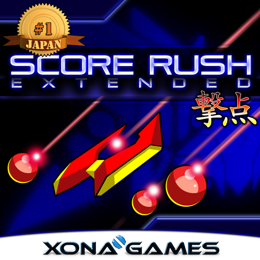
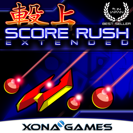
Consider an American who knows nothing about the game: Which title screen below best conveys the Japanese-centric nature of the game?
Image

vs.

Image
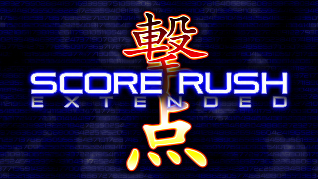
The use of Kanji is quite powerful in this consideration.

Also the Kanji was run past various Japanese and Chinese friends of mine, and it passes their test. It does not mean "Score Rush" and this is completely ok. As far as I know, it means "Shooting Point", "Attack Point", or "Hammer Point", or a mix of all of these. It is aggressive and fitting to the gameplay. And it is contained within 2 characters. I am not interested in a long written form, such as "~スコア ラッシュ~". This, again, is due to the throwback to Raiden and the likes.

I appreciate all of your desires to be authentic and accurate, and it is something I run into on these forums a lot so I should expect it. When it comes to marketing, sometimes the point is to convey a feeling or idea rather than an accurate story. The marketing really is never for the experts like you all.


Pixel_Outlaw,

Greetings! :) I still have feelings for Duality ZF, so maybe someday! No promises. I wish to see how our games do on next-gen systems and Score Rush is a fitting test. If it works out well, Duality ZF may have a chance to exist at last.
Matthew Doucette, Xona Games
Score Rush Extended [PS4]: viewtopic.php?t=55520
User avatar
Xonatron
Posts: 658
Joined: Fri Aug 29, 2008 7:01 pm
Location: Nova Scotia, Canada
Contact:

Re: Which box art is better?

Post by Xonatron »

I adjusted the sizing and spacing a bit to read the 撃点 Kanji better:
Image
Matthew Doucette, Xona Games
Score Rush Extended [PS4]: viewtopic.php?t=55520
User avatar
Skykid
Posts: 17661
Joined: Sun Nov 18, 2007 2:16 pm
Location: Planet Dust Asia

Re: Which box art is better?

Post by Skykid »

Xonatron wrote:Skykid, why? Lots of shmups do this, including Raiden. Not challenging you, as I would rather it was not obscured myself. The Kanji is for Americans (who cannot read it), not for my Japanese audience, so it is ok to be partially obscured in this sense. I do wish it were able to be read however. I have tried the same design with smaller Kanji and then it gets smaller enough that the #33 design (first post) works better for placement.
As someone who is currently employed as a graphic designer, obscuring the characters is kind of a no-no unless there's some kind of relevance in doing so. Here they're just kind of shoved behind the banner to create a colour offset. But regardless of the target language speaking audience, you shouldn't be really obscuring primary text. If it's secondary text (like a kind of image dressing) then it doesn't matter what you do to balance the image.

But - everybody sees things differently. I'd suggest a rearrangement but in the end go with whatever you feel makes you happy.
Always outnumbered, never outgunned - No zuo no die

User avatar
Xonatron
Posts: 658
Joined: Fri Aug 29, 2008 7:01 pm
Location: Nova Scotia, Canada
Contact:

Re: Which box art is better?

Post by Xonatron »

Skykid,

I do appreciate that as a general rule of art design. It is definitely secondary text. The target audience is illiterate to the language. That said, I did un-hide it! :) What do you think of that last design I just posted?
Matthew Doucette, Xona Games
Score Rush Extended [PS4]: viewtopic.php?t=55520
User avatar
Skykid
Posts: 17661
Joined: Sun Nov 18, 2007 2:16 pm
Location: Planet Dust Asia

Re: Which box art is better?

Post by Skykid »

Speaking from a typographical point of view, the traditional style Kanji doesn't work so well for me with the futurist style of the English. There's definitely a way to make the two work, which would probably involve making the Kanji ancient calligraphic style and flat (no highlights) but that would also require changing the entire colour tone of the piece, simplifying it into something more minimalist.

Personally I prefer the one with no Kanji, but if you're trying to convey a feeling of Japaneseness it's probably not a good idea to drop it.
Always outnumbered, never outgunned - No zuo no die

User avatar
Xonatron
Posts: 658
Joined: Fri Aug 29, 2008 7:01 pm
Location: Nova Scotia, Canada
Contact:

Re: Which box art is better?

Post by Xonatron »

Skykid, I like the minimalist style too. If everyone knew what Score Rush was, I would go with it. (This being the first "real" release -- not hidden away on XBLIG -- I am fairly certain the game is relatively unknown.) Even the box art used to be minimal:
Image
Matthew Doucette, Xona Games
Score Rush Extended [PS4]: viewtopic.php?t=55520
Post Reply