
I actually laughed at that! Excellent pick.Obiwanshinobi wrote:Bump 'cause I want y'all to see it:
Spoiler
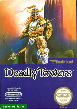
When Japanese box art is the worst
Re: When Japanese box art is the worst


光あふれる 未来もとめて, whoa~oh ♫
[THE MIRAGE OF MIND] Metal Black ST [THE JUSTICE MASSACRE] Gun.Smoke ST [STAB & STOMP]
-
EmperorIng

- Posts: 5223
- Joined: Mon Jun 18, 2012 3:22 am
- Location: Chicago, IL
Re: When Japanese box art is the worst
Naw, it's a cigarette because the dude is so hardcore he smokes and doesn't take nuttin' from nobody - like threatening to strangle people with their entrails and then not doing it.Some-Mist wrote:that's bad though. does he have a sucker in his mouth?pestro87 wrote:Spoiler


Pictured: Sadler chillin' with his braindead anime girlfriend, tokin' it up.

DEMON'S TILT [bullet hell pinball] - Music Composer || EC2151 ~ My FM/YM2612 music & more! || 1CC List || PCE-CD: The Search for Quality
-
Obiwanshinobi

- Posts: 7470
- Joined: Sun Jul 26, 2009 1:14 am
Re: When Japanese box art is the worst
Another mild example, but I like the US cover better for carrying on the spirit of some illuminated manuscripts (not particulary well illuminated ones, but that's the point).

The Japanese cover doesn't look any exceptional in the cold light of A.D. 2015.

The Japanese cover doesn't look any exceptional in the cold light of A.D. 2015.
The rear gate is closed down
The way out is cut off

The way out is cut off

Re: When Japanese box art is the worst
^ The western one is fucking terrible!
Always outnumbered, never outgunned - No zuo no die
ChurchOfSolipsism wrote: ALso, this is how SKykid usually posts

Re: When Japanese box art is the worst
I have to agree but dat mullet thoSkykid wrote:^ The western one is fucking terrible!
Re: When Japanese box art is the worst
Would've been cooler if they'd gone totally balls to the wall and given it a monochrome woodcut effect. Probably commercial suicide but it would've been an admirable one, ala SNES Phalanx. ^__^
光あふれる 未来もとめて, whoa~oh ♫
[THE MIRAGE OF MIND] Metal Black ST [THE JUSTICE MASSACRE] Gun.Smoke ST [STAB & STOMP]

Re: When Japanese box art is the worst
Western Dungeon Explorer art is so '80s mass circulation magazine cartoonist style it's not funny. D
It just needs a cat with crazy whiskers sitting behind the castle, glowing like he's hooked up to an Ecto Cooler IV.
On the plus side, it's nice to know how the '80s Skyrim cover would have looked (truth in advertising, at least).
It just needs a cat with crazy whiskers sitting behind the castle, glowing like he's hooked up to an Ecto Cooler IV.
On the plus side, it's nice to know how the '80s Skyrim cover would have looked (truth in advertising, at least).
Re: When Japanese box art is the worst
Ah, ^ that's what I was being reminded of!  READERS DIGEST MUHFUCKA
光あふれる 未来もとめて, whoa~oh ♫
[THE MIRAGE OF MIND] Metal Black ST [THE JUSTICE MASSACRE] Gun.Smoke ST [STAB & STOMP]
-
Obiwanshinobi
- Posts: 7470
- Joined: Sun Jul 26, 2009 1:14 am
Re: When Japanese box art is the worst
Is the glow explained in game? Reminds me of Demon's Souls where the playable character looks permanently powered up.
On a side note, funny how the 2007 Alien Syndrome tries to re-create Diablo II-style light sourcing in 3D, but something about it looks awkward (funny as countless humble polygonal Diablo-likes, heck, the ancient-looking Gauntlet Dark Legacy did lighting of all things properly before).
In this kind of settings, I think Rune artwork looks the just right sort of cartoony:
The rear gate is closed down
The way out is cut off
The way out is cut off
Re: When Japanese box art is the worst
^ Aaaand tangent.
Always outnumbered, never outgunned - No zuo no die
ChurchOfSolipsism wrote: ALso, this is how SKykid usually posts

Re: When Japanese box art is the worst
Take your pick:

Re: When Japanese box art is the worst
^ of course the JP is better.
Always outnumbered, never outgunned - No zuo no die
ChurchOfSolipsism wrote: ALso, this is how SKykid usually posts

Re: When Japanese box art is the worst
Actually I disagree, the JP cover is really poorly illustrated. The US cover has pretty neat style going for it.
@trap0xf | daifukkat.su/blog | scores | FIRE LANCER
<S.Yagawa> I like the challenge of "doing the impossible" with older hardware, and pushing it as far as it can go.
<S.Yagawa> I like the challenge of "doing the impossible" with older hardware, and pushing it as far as it can go.
Re: When Japanese box art is the worst
It's a picture of an American high school jock in a red cape. It's fucking terrible.
Always outnumbered, never outgunned - No zuo no die
ChurchOfSolipsism wrote: ALso, this is how SKykid usually posts
Re: When Japanese box art is the worst
Speaking of which, Victor Ambrus apparently did a lot of work for that rag back in the day. His style is pretty unique and I think it'd fit a game (maybe something by Koei?) pretty well. Just look at Google images; tons of illustrations there. Kind of a sketch / watercolor hybrid.BIL wrote:Ah, ^ that's what I was being reminded of!
RE Elemental Master...man Skykid, turn in your art critic badge. US cover is closer to a common style of the time but it's very well executed. JP cover is just bad. Even the overall composition blows.
-
Obiwanshinobi
- Posts: 7470
- Joined: Sun Jul 26, 2009 1:14 am
Re: When Japanese box art is the worst
Reminds me of some artwork (stills) I saw in Bagpuss.Ed Oscuro wrote:Kind of a sketch / watercolor hybrid.
The rear gate is closed down
The way out is cut off
The way out is cut off
Re: When Japanese box art is the worst
This is now the Bagpuss thread.

Re: When Japanese box art is the worst
(To the tune of John Lennon's Mother)
Bagpuss come hooome,
Why no console po-ort?

Bagpuss come hooome,
Why no console po-ort?
光あふれる 未来もとめて, whoa~oh ♫
[THE MIRAGE OF MIND] Metal Black ST [THE JUSTICE MASSACRE] Gun.Smoke ST [STAB & STOMP]

Re: When Japanese box art is the worst
Almost watched some BAGPUSS last night. TOO SOON.
BIL wrote: "Small sack, LOTS OF CUM" - Nikola Tesla
Re: When Japanese box art is the worst
The JP cover IS poorly illustrated and the composition is badly executed. In terms of actual finish, I ain't got no argument: the US cover has a clear higher level of detail and finer execution.Ed Oscuro wrote: RE Elemental Master...man Skykid, turn in your art critic badge. US cover is closer to a common style of the time but it's very well executed. JP cover is just bad. Even the overall composition blows.
Stylistically it's also absolutely horrible. A photo/photorealisitic man who is not representative of any character in the game, defined not as a wizard or mage, but as a Wall Street banker who woke up in some abyss with only his Michael Jackson finger cut-offs for power. It's horribly tacky.
The JP one for all its flaws is at least representative of the game, is less tacky, and altogether less offensive.
Art critic badge staying firmly on for this one.
Always outnumbered, never outgunned - No zuo no die
ChurchOfSolipsism wrote: ALso, this is how SKykid usually posts
Re: When Japanese box art is the worst
Look at dis guy, wants truth in advertising. I think the lo-res copy shows off the relative compositions well - as far as that goes, this cover is actually one of the better compositions in the thread, along with the JPN Dungeon Master one. It's a simple, pleasing symmetrical design. Even better than Dungeon Master, it features at least one real color! The only real downside is the L. Ron Hubbard style Ming the Merciless hands, but that's still a damn sight better than King Walrus over on the right (I actually regret looking closely, and that's a rare thing to feel...I don't want that thing in my house).
Sure, the dude on the front, who you have an excessively acute phobia of, is dated and even a bit tacky (though, dressed like that, where would you fear going?). You want dated and tacky, I'll pile up all the dusty sombreros, Elvis Presley memorabilia, weird '60s interpretations of Queen Anne portraits, and fake jade bottles cluttering up the world's antique stores.
You know what's also dated and tracky? The gigantic gray score display in the game itself. Now that's worth regretting, and choosing the JPN copy won't save you from it.
-
Squire Grooktook

- Posts: 5997
- Joined: Sat Jan 12, 2013 2:39 am
Re: When Japanese box art is the worst
I have to agree with Skykid on Elemental Master.
Jp Cover is unworthy of the games excellence, but it's still a notch above the western one. It's representative of the game, has a nice blueish sky contrasting the copious red present in both covers, and overall just looks slightly better IMO.
Jp Cover is unworthy of the games excellence, but it's still a notch above the western one. It's representative of the game, has a nice blueish sky contrasting the copious red present in both covers, and overall just looks slightly better IMO.
Aeon Zenith - My STG.RegalSin wrote:Japan an almost perfect society always threatened by outsiders....................
Instead I am stuck in the America's where women rule with an iron crotch, and a man could get arrested for sitting behind a computer too long.
-
Obiwanshinobi
- Posts: 7470
- Joined: Sun Jul 26, 2009 1:14 am
Re: When Japanese box art is the worst
The blue lettering contrasts red on Genesis cover. Framing of the Japanese one is lamentable and the bent-over fairy looks tacked on (as if the picture wasn't plain poor without her).
Now, Dungeon Explorer US cover looks anything but plain.
Mœbius once said adding detail is a well-known (to the artists) stunt for the sake of making a poor drawing seem decent. Well, didn't quite work out that time around.
Now, Dungeon Explorer US cover looks anything but plain.
Mœbius once said adding detail is a well-known (to the artists) stunt for the sake of making a poor drawing seem decent. Well, didn't quite work out that time around.
The rear gate is closed down
The way out is cut off
The way out is cut off

Re: When Japanese box art is the worst

Damn Tim, you know there are quite a few Americans out there who still lives in tents due to this shitty economy, and you're dropping loads on a single game which only last 20 min. Do you think it's fair? How much did you spend this time?
Re: When Japanese box art is the worst
I knew Elemental Master would make it's way in here. The JP cover is one of the most amateur I've seen. I agree that while it's not great it does fit better with the actual game than the US version, which as Skykid has pointed out is stylistically challenged.
Also the fairy is missing from the US cover
Also the fairy is missing from the US cover
Facebook is for handbag users.
XBox Live Name: Katbizkitz
XBox Live Name: Katbizkitz
Re: When Japanese box art is the worst
What the hell is Bagpuss?
Damn Tim, you know there are quite a few Americans out there who still lives in tents due to this shitty economy, and you're dropping loads on a single game which only last 20 min. Do you think it's fair? How much did you spend this time?

Re: When Japanese box art is the worst
A lion that says "exit, stage left" and "Heavens to Murgatroyd".Strider77 wrote:What the hell is Bagpuss?