opt2not wrote:Yup it’s pretty hypocritical. These haters are nit-picking at silly stuff like shadows and referring to SoR2 as their benchmark, yet that game wasn’t perfect either. Blaze had freakishly dis-proportionate legs. Those thighs are too long and at a weird bend. It doesn’t make sense for her stance and her shins look so short and stubby.

this is from the article you linked, earlier, and i don't know how you can look at the one on the right as what to uphold while picking on the one on the left. say what you will about anime girls (which i'd say blaze in SoR2 heavily leans toward - hate comparing a sprite to a high res digital piece like this because you're meant to experience old sprites on a CRT), but the way that "sexy" western comics art is done and what it does to the body are just goddamn weird, to me. i see some male animators and comics artists bend over backwards to justify their approach, sometimes going through insane mental gymnastics of evolutionary male attraction to female form, and i think they start losing themselves in myopic justification of their style. blaze's proportions are a little weird in her old SoR2 sprite, sure, but i don't think proportions and anatomy matter tremendously so long as the communication is apt, and that's a beloved sprite for a reason.
i would never say that the sor4 key animator is untrained or incompetent, but the leap in style is very substantial. what western comic art tends to accentuate via its cartoonish abstraction of form is so different that the character loses recognizability - and i'd say this for the whole cast, including the enemies. watching trailers, i didn't even recognize returning enemy cast until seeing names pop-up and finding myself in disbelief. what i meant earlier with my "reddit gold" dig is that this is like, run-of-the-mill modern western comics art that you see all over the place, these days. the kind of "i redesigned this, check it out" posts you see all over reddit that get clamoring from the lowest common denominator. it's generic and i really feel it has no 'take,' i prefer amateur art because it is usually at least saying something.
so, i agree that it's a bit refined, laborious, expensive, and even trained - the key animator has talent! never meant to imply otherwise. however, it is also jarringly different even if you disagree with it being what i'd consider ugly. it's not at all just that it's
western (i just bought canadian artist prints today, i enjoy some western comics and their art and own a few hardbacks, i even just bought a venture brothers artbook for pete's sake), it's that it's like... the garbage you see all over today's most popular capes comics. people may be inarticulate or flippant when they just say "it's bad," but man, a lot of them have pretty good reason to given the upsetting ubiquity of that stuff and its encroachment on everything. the game is called "streets of rage 4" and built on a highly revered series with some heavy, particular style to it. people usually stay in their lane with their criticism - i mean, i don't read avengers comics and go "damn fukken uggo western dogshit" (despite thinking that) because i am not drawn to it to begin with. however, it ain't the mass of us ambivalent-to-repulsed by this that are crossing a lane, here, it's the people who made the game.
even getting over my disdain for the style, which i really don't want to turn this into an argument over and have more than made on my piece on, the biggest problem i have is probably foreground/background composition for a
huge variety of reasons. i tried to focus on this in my last post and have my "eugh god western comics pop art" disses to a minimum, because it is really pressingly what upsets me more than anything and something i think that even if i somehow liked the style i'd still find severely detrimental. even getting past all the ugly Expensive Modern Game touches like the lighting, shadows, etc., you've got backgrounds with lots of color gradient and sometimes very few or very softly defined lines with characters who have extremely thick black lines and simple coloring. neither of these, putting aside my distaste for the style, are individually bad or lacking in elbow grease, but they are lacking in cohesion with each other.
the palettes are probably the most pressing source of issue, here, because i feel like there's extremely little successful contrast. even on
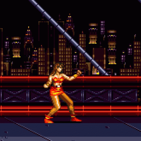
really tiny thumbnails of SoR2 screens, you can immediately identify the characters and where they are because of the relative vibrant colors on characters and relative darker colors of backgrounds. this is assisted tremendously by the low resolution of the art and limited overall palette selection forcing solutions like this, which i think is a big part of the appeal of pixel art & older games, in general. creativity through limitation is pretty interesting, and i want to admit i'd probably find sor2 uglier if the same art team redesigned it in high res with vectored sprites and super detailed bg's (though maybe they'd surprise me!)... but they were working on a console with a kind-of muddy palette and pretty substantial technical restrictions and busted out one of the most memorable works in its library.
when the backgrounds in sor4 do contrast with the characters, which is not often and not substantially, my attention is drawn to the line thickness/darkness difference. you see this in cartoons all the time to make cels pop in front of their backgrounds and the characters/foreground environment feel alive, but i feel like this backfires in a game like this. i start to feel it is really obvious that characters aren't really 'on' the background and i'm just watching a layer of sprites interact with each other, probably because the background extends to to the viewer and all imaginary z axis animation is just the characters moving up/down on the screen without getting smaller or larger. that's a pitfall of working with belt scrollers altogether, but i feel like keen palette pop works elegantly enough and line contrast instead sabotages composition. this is where i think a lot of the "looks like a flash game" complaints come in, maybe compounded with some of my earlier criticism levied at the weird layer work and varying FPS of things movin around. these things give you some of that classic dissonance you get with the disparate assembled parts of what people are used to seeing from flash titles.
- - - - -
sorry for HUGE TEXT POST, but, in short, i think the game is ugly beyond matters of taste, and that matters of taste in this instance warrant the angry dismissive responses that many have been giving because this is
Streets of Rage 4 and not, uh, something else.